While there's unarguably greater awareness than ever that man-made climate change is contributing to global warming and rising sea levels, it can be difficult to visualise what that exactly means for the city you live in. How high will sea levels rise? When will it happen? Where will it happen? And, most importantly, what can we do about it?
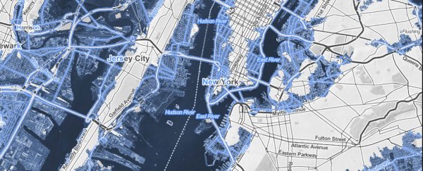
These are the questions that this stunning new interactive map is designed to get you thinking about. Mapping Choices is part Google Maps, part time machine. It lets you choose any US city or zip code to see what rising seas will do to your nominated address, based on a range of projections about how high sea levels could increase.
Created by Climate Central, an independent US-based environmental awareness organisation, Mapping Choices bases its data on new research published this week in PNAS. The map is designed to highlight that the extent to which sea levels will rise is not yet locked in. Rather, how much we allow rising seas to swamp low-lying lands and swallow coastal cities in the future is dependent on the ongoing efforts we make to address climate change now.
In addition to letting you view any region in the US – an international version of the map is coming in November – Mapping Choices also lets you configure your view to compare side-by-side how different responses to curb pollution will impact the environment differently, resulting in a range of potential sea-level scenarios.
You can choose between unchecked pollution, minor carbon cuts, moderate carbon cuts, extreme carbon cuts, or historic carbon pollution, as well as controlling how long the human population chooses to pollute in that manner. Frankly, the results of none of these are what you'd call "good" – but there's a big difference between the worst and best outcomes.
It's important to note that Mapping Choices isn't designed to show us what the world will look like within a defined timeframe – such as this century, for instance – as the science on just how fast sea levels are rising remains a matter of scientific debate. Rather, the interactive map is supposed to show sea levels that could lock in this century and occur as early as 2200.
In the worstcase scenario, with unabated carbon emissions extending from now through to 2100, the researchers estimate we'd see sea levels rise between 4.2 metres and 10 metres. For an even more striking illustration of what this kind of inundation would look like in US cities, you can see some alarming artistic representations by Climate Central here and here.
"The sea level rise we map may take centuries to play out," Climate Central explains on its website, "but we set it in motion today."