Fair warning: If you are one of those "liberal, tree-hugging hippies" who wants the world to move away from burning fossil fuels, these graphs are going to depress you.
Because it appears that despite the recent and extraordinary growth in renewable energy forms, the world just can't seem to quit coal.
Three charts, produced and published by the oil and energy giant BP, which releases a Statistical Review of World Energy every year, has revealed that after several years of free fall, the global consumption and production of coal is making a comeback.
Looking at the first graph, you can see that last year, coal consumption grew for the very first time since 2013.
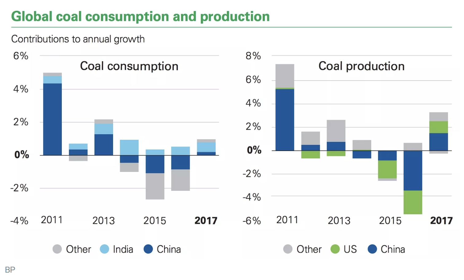
The growth in coal consumption, displayed above, comes mostly from the developing world, accounting for nearly 80 percent of the increase. Of all these countries, India's consumption is rising the fastest, however, after three years of decline, China's coal consumption is also on the up and up.
And, even though US consumption of coal has fallen in recent years, America's coal producers are feeding off the world's growing demand for coal.
While China's coal output in 2017 increased by 3.6 percent, America's coal output increased by nearly double that number, shooting up by 6.9 percent.
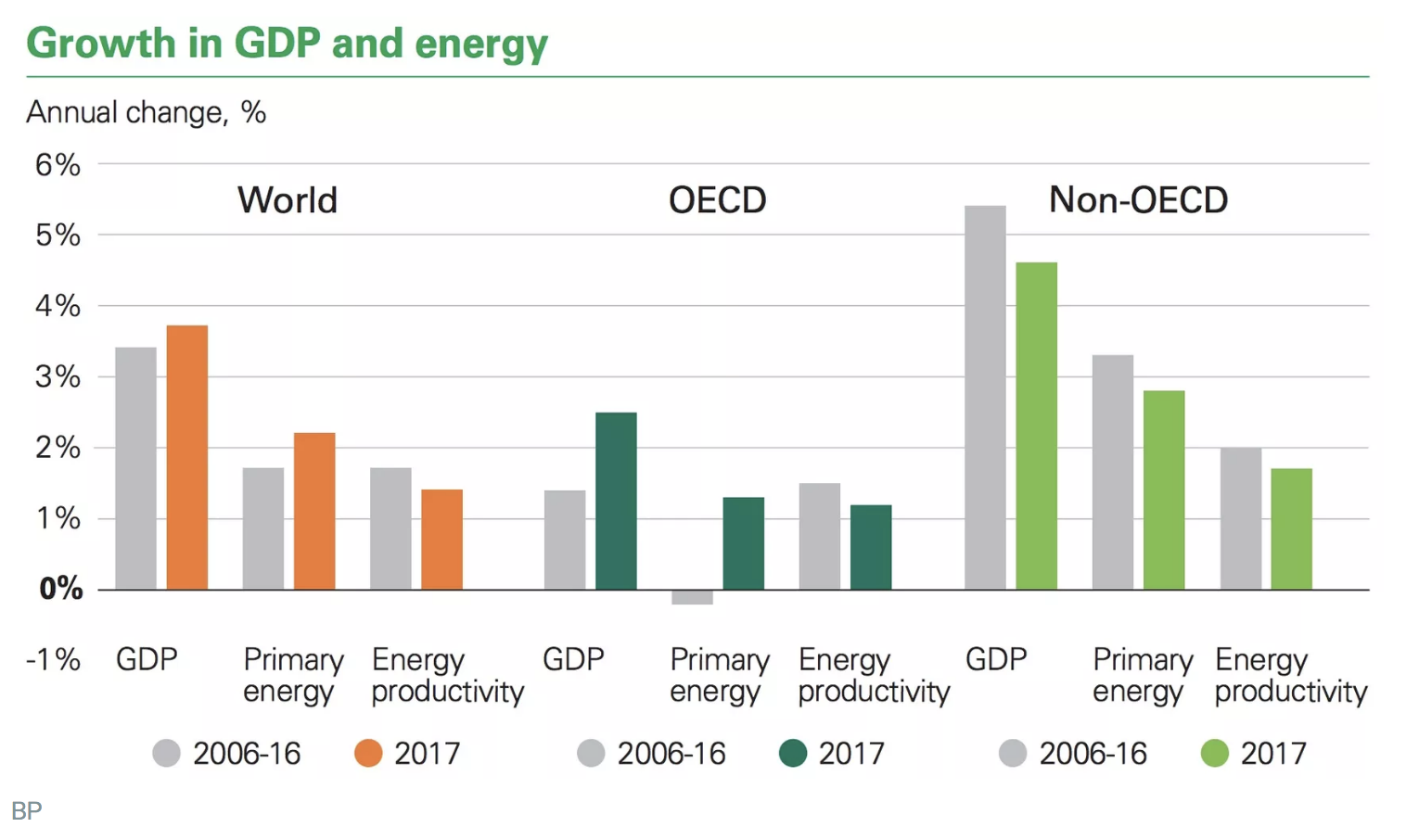
Spencer Dale, a group chief economist, has analyzed the graphs, and in his analysis, he explains that a burst in coal consumption is directly related to the world's booming economy.
As a consequence of burning more fossil fuels, global carbon emissions are growing for the first time in years. The results suggest that despite wide-reaching policies to promote and incentivize renewable energy, a booming economy and increased carbon emissions are still firmly entwined.
As discouraging as these graphs are, Dale has warned against undue alarmism, saying that both of these graphs are perhaps best seen as "two steps forward, one step back."
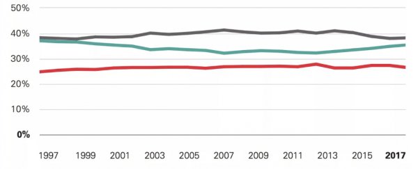
There is one chart, however, that seriously worries Dale. It reveals that the world's mix of energy sources has not changed in the past 20 years.
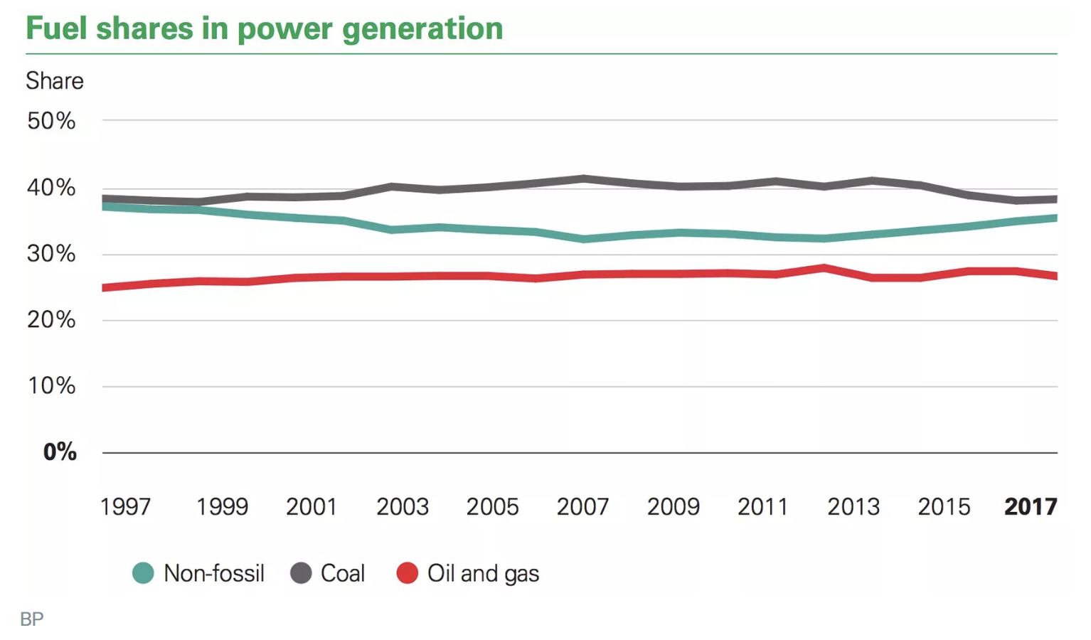
Last year, the share of coal in the power sector sat around 38 percent. It pains me to tell you this, but that is the exact same percentage that it was in 1998. In two decades, almost zero progress has been made.
Dale says this is the most striking and worrying graph because the power sector is the single most important source of carbon emissions, accounting for over a third of global emissions in 2017.
"The share of non-fossil in 2017 is actually a little lower than it was 20 years ago, as the growth of renewables hasn't offset the declining share of nuclear," he wrote in the analysis.
"I had no idea that so little progress had been made until I looked at these data."
The whole thing is seriously discouraging, because it means that despite huge policy efforts, like the Paris accord, the power sector looks almost identical to its 1990s counterpart.
"To have any chance of getting on a path consistent with meeting the Paris climate goals there will need to be significant improvements in the power sector," Dale writes.
"But this is one area where at the global level we haven't even taken one step forward, we have stood still: perfectly still for the past 20 years. This chart should serve as a wake-up call for all of us."