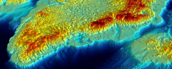
Scientists just published a map of what lies beneath the Greenland ice sheet, the most accurate and comprehensive chart of this terrain yet, and it's going to be crucial in making calculations about potential sea level rises in the future.
Drawing from data collected by more than 30 institutions, the snappily named Greenland Basal Topography BedMachine v3 map lets experts see the changes on the territory's coast in unprecedented detail.
It's like viewing Greenland with the ice sheet taken off, and the international team of researchers responsible for putting it together says it gives us some valuable information about how Greenland might respond to rising temperatures in the years to come.
"This new compilation of the 3D landscape beneath the Greenland ice sheet provides the first seamless transition between the landmass and its adjoining seabed," says one of the team, Peter Fretwell from the British Antarctic Survey (BAS).
"This gives scientists a bird's eye view of the fringes of Greenland which are experiencing the most changes."
To make the map, scientists drew together years of radar and seabed mappings taken from boats, planes, and satellites, adding in some computer modelling to estimate the shape of some of the most hard-to-reach fjords.
Scientists already know the height of much of the Greenland ice sheet, and if they know the height of the rocks beneath, they can work out just how much ice there is – and the kind of sea level rises that could be caused if all of it were to melt.
Knowing the thickness of the ice can also be useful in calculating how fast it's likely to melt. Greenland is currently losing about 260 billion tonnes of ice to the ocean per year.
"There is more ice and the bed is deeper in some places than previous maps suggest," says Fretwell. "This means the total contribution from the ice sheet to global sea level rise would be 7.42 metres (24 feet) if it were to melt completely, slightly higher than previously calculated."
Although the map has revealed that some glaciers are thicker than previously thought, the visualisation has also highlighted the danger of warmer ocean currents, which can work up underneath the ice and break it apart.
This partly depends on the shape of the fjords cutting into the ice, as some channels have tall ridges or sills that keep out warmer water from the ocean – another topographic feature researchers can check on the new map.
"If you get increased melting from below, you can get big channels forming on the underside of the floating front of the glacier and this can lead to thinning and fracturing that then make the glacier potentially more predisposed to breaking up," researcher Kelly Hogan from BAS told Jonathan Amos at the BBC.
Ultimately the map of the underlying rock is going to give experts a much better idea of how the ice sheet might shift, melt, and drain in the coming years. It can also be used to highlight the parts of Greenland's ice that are under the greatest threat.
Our changing climate isn't just causing cracks in the Greenland glacier, it's also putting the territory at risk from wildfires as the coastal ice thaws out. Any help scientists can get to understand this complex picture is going to be welcome.
"It's great to see our data being visualised in this way and being available to share it with other researchers," says the study's leader author, Mathieu Morlighem from the University of California at Irvine.
"There are still some areas such as fjords for which we need more measurements, so we will keep improving this map as more data becomes available."
The research has been published in Geophysical Research Letters.