Have you reached the right time in your relationship to move in with your significant other? Or even get married? A mesmerising new data visualisation can help you see how your relationship timeline matches up with both modern couples and those from the 1970s.
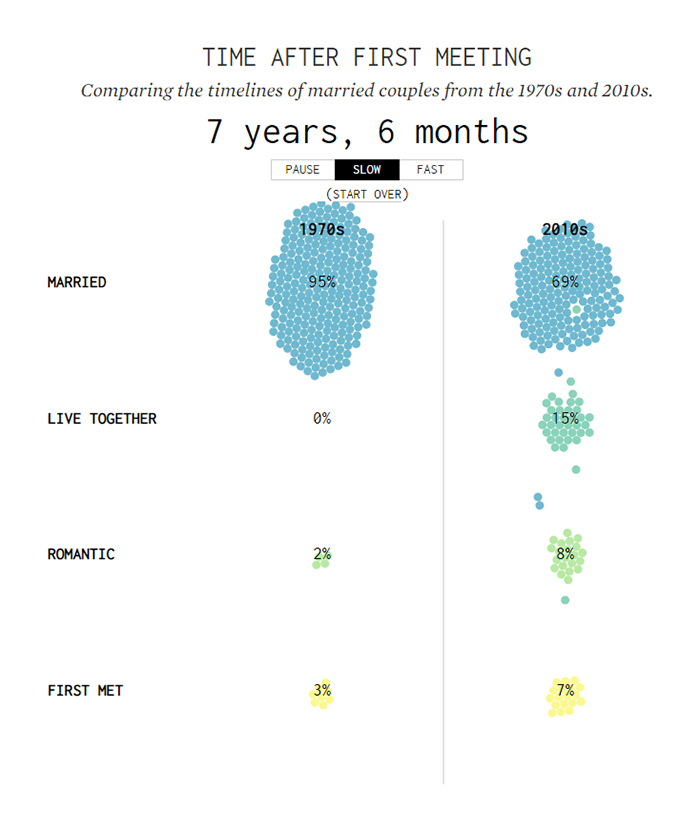
Put together by statistician Nathan Yau based on 3,510 responses to the How Couples Meet And Stay Together survey, the animation charts the progress of couples - from first meeting, to becoming romantically involved, to starting to live together, to getting married.
The stages of relationships towards marriage https://t.co/vT9aote2WG pic.twitter.com/aevdhWpUa7
— Nathan Yau (@flowingdata) March 26, 2019
The visualisation is a follow-up to a more basic timeline showing how the progress of relationships has changed over time.
One thing is clear: People are waiting longer to get married – or not getting married at all. But the visualisation also reveals some interesting exceptions, or 'extreme' cases.
"In this view, you can better see the variation and extremes," says Yau. "You can see the people who married within the first few months after meeting. There are the people who married five decades after first meeting."
"I think there's a romantic comedy script hidden somewhere in there."
 (Flowing Data)
Something that appears to have stayed constant is the time between first meeting and starting a romance. Based on the median average, this has risen by just one month since the 1970s.
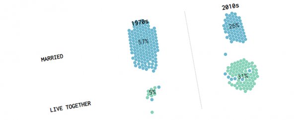
Further down the line, the differences are clearer. After four years, for example, 74 percent of couples in the 1970s are married, with only 2 percent living together. In the 2010s, on the other hand, 44 percent of couples are married, with 24 percent cohabiting.
At the 10-year stage, 96 percent of 1970s couples have decided to tie the knot, compared with 76 percent of 2010s couples. In terms of this animation, the dots (or couples) are taking longer to flow upwards.
What's also noticeable is how few dots stick around for long at the "live together"stage in the 1970s column – back then, people tended to go straight from living separately as a romantic couple to getting married.
If you're wondering whether you're behind or ahead of the average couple out there, these colourful dots can fill you in.
Of course relationships represent a fundamental part of our lives, and scientists continue to explore what brings us together and pushes us apart, as well as how relationship trends change over time.
We know that marriage can cause both physical and mental changes to a person – and they're not all positive, even if married people tend to be healthier overall (remember that next time you're rowing with your partner).
And if you're wondering whether your current relationship is worth sticking with, scientists have even come up with 15 questions to help you weigh it up.
What's certain is that the way we meet and love each other continues to shift. The same survey used to create the visualisation above has also been the source of a couple of unpublished papers, including one that finds we're now using the internet to meet people, rather than relying on family and friends.