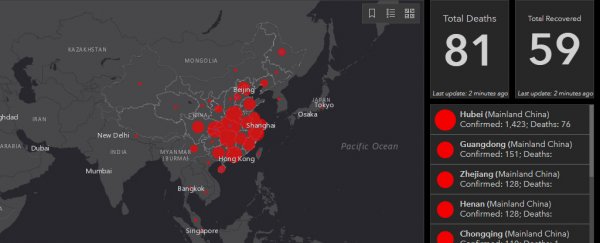
The death toll of the coronavirus that originated in Wuhan, China, has reached at least 81, and the virus has infected more than 2,800 people.
A map produced by researchers at Johns Hopkins University tracks and visualizes reports about the outbreak using data from the Centres for Disease Control and Prevention, the World Health Organisation, China's CDC, and other sources with geographic-information-system mapping.
As reports come in, the map keeps track of the total confirmed cases, total deaths, and total recoveries. Each red dot represents an outbreak, with the size corresponding to the relative size of the outbreak. Clicking on one shows the region's information.
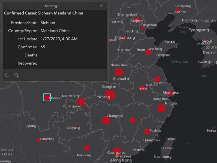 (Johns Hopkins)
In the panic and confusion often found amid an outbreak, false information can spread quickly. Adding to the confusion, China seems to have suppressed information about the illness in its early days.
At least eight people were arrested in China, accused of "publishing or forwarding false information on the internet without verification" about the coronavirus. Journalists reported being threatened and detained after reporting on the virus.
One chart on the dashboard shows how quickly the virus has spread in mainland China compared with the rest of the world.
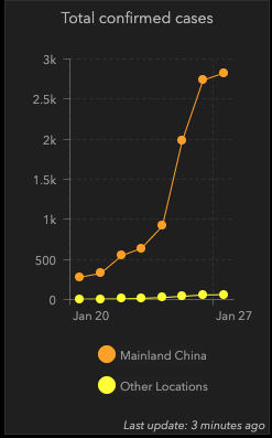 (John Hopkins)
So far, the virus has spread to 13 other countries, including the US, France, Australia, and Japan.
Experts expect that the true number of people infected is much higher than the official total.
While health officials have said they think this coronavirus will be milder than SARS, Wuhan has been quarantined, and at least 12 other cities have imposed travel restrictions, affecting an estimated 33 million people.
This article was originally published by Business Insider.
More from Business Insider: