Many of us have been there. Subtly tweaking the margins, increasing only the punctuation size across the board, dragging out paragraphs or adding more block quotes, all in an effort to finally get to an assignment's minimum page count.
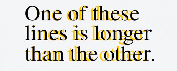
Now, there's a sneaky new typeface that claims to boost the apparent length of your essay or term paper by up to 10 percent - without resorting to any other cheats, and without you needing to write a single extra word.
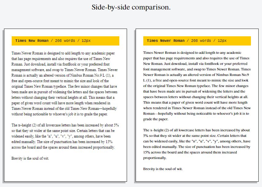
It's called Times Newer Roman, a free font released by the quirky online marketing firm MSCHF. According to the typeface's website, a single-spaced 15-page document in 12pt type would only require 5,833 words, in contrast to 6,680 words if you were using good ol' Times New Roman.
What is this witchcraft? It's all down to a few relatively simple, yet genius tweaks of the classic serif typeface that's been in circulation since 1932.
To achieve the effect, the team at MSCHF took Nimbus Roman No.9 L - an open-source font that serves as the modern, free equivalent of Times New Roman. Then, they slightly changed all lowercase letters by about 5 percent, adding width to the entire text.
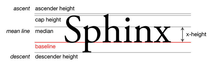
The way they did this is absolutely brilliant. Instead of simply stretching each letter, which would be immediately noticeable, the creators of this cheat font messed with one of the most important metrics of any typeface - the x-height.
Based on the height of (you guessed it) the lowercase letter x, it's the distance between the baseline and the top of flat letters such as x, v, w, and z:
It may seem counterintuitive, but by boosting the x-height, each lowercase letter ends up occupying slightly more space, while the overall vertical height of the typeface remains the same, conserving the overall appearance.
On top of that, they also made punctuation 15 percent bigger, and increased spacing here and there.
You can see what kind of apparent length improvement you could get with this side-by-side comparison from their website:
 (timesnewerroman.com)
Now, there are obvious limitations to this approach of cheating on your assignment page counts.
Firstly, Times New Roman needs to be the typeface required by your educator.
Secondly, your assignment needs to be printed out for this to work optimally. Submitting your essays as pdf files might also pass, but here at ScienceAlert we noticed there can be discrepancies between how different computers render Times Newer Roman in the word processor, which means it may also look wonky in a pdf.
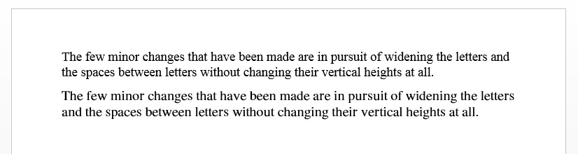
While 14pt Times Newer Roman looked pretty great in Microsoft Office on Windows or in Pages on iOS, the results were not so great in Open Office on Windows (can you tell which typeface is which?):
 (Microsoft Word/Windows)
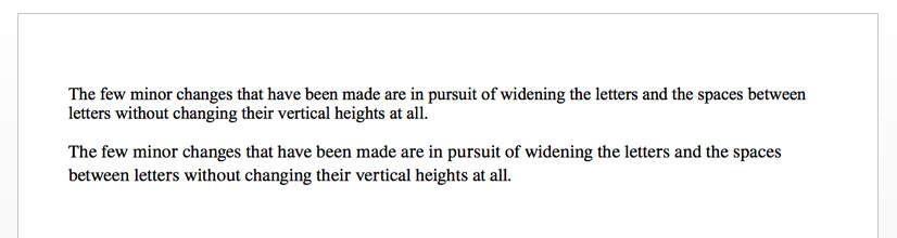 (Pages/iOS)
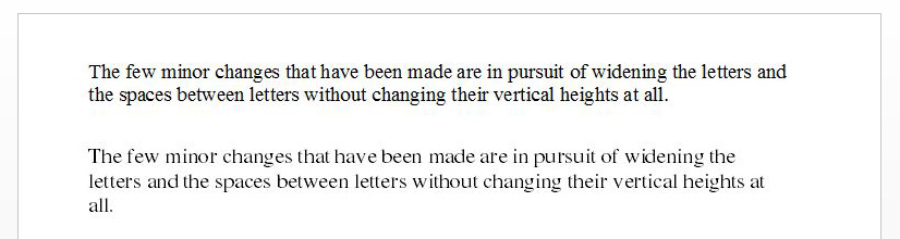 (Open Office/Windows)
Meanwhile, even the wonky document prepared in Open Office did look terrific when printed out, confirming the trick works beautifully on actual paper:
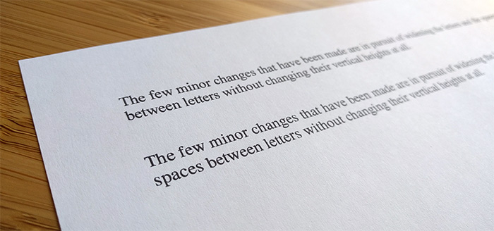 (Open Office/Windows)
Thirdly, cheating is bad and you might get caught anyway, so don't say we didn't warn you.
But if you're keen to give this clever typeface a spin for totally legitimate and not at all academically dodgy reasons, you can download it here.