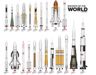
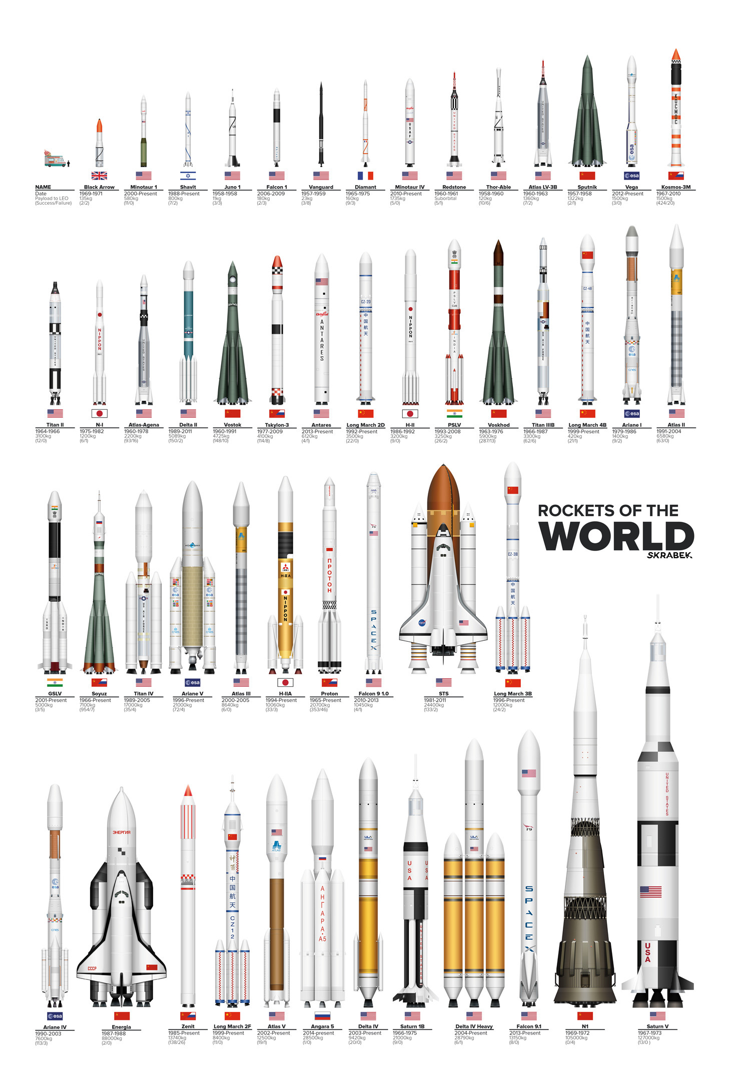
The above graphic, which you can see in all its zoomable glory here, was created by artist Tyler Skrabek, and shows all of the rockets in the world drawn to scale.
The clean, minimalist illustration was inspired by a 1995 poster by professor Peter Alway, which was published in the book Rockets of the World.
As Nancy Atkinson reports on Universe Today, Skrabek first started thinking about the project in 2012, and spent three months creating it.
"I find it fascinating that we as a society have the power to take a person, put that person inside a metal box on top of a cylinder filled with explosives and explore space," Skrabek wrote on his website.
"As an active member in space circles, I realised there was a lack of infographics that did a reasonable job of portraying comparisons between the various types of spacecraft while being visually appealing. I decided to research and develop a series of infographics to better explain this to the everyday person."
Of course, the illustration doesn't show all of humanity's rockets. "Just to keep things tidy I choose not to include rockets that haven't flown yet on the off-chance they don't actually make it off the ground," Skrabek wrote on reddit. "But rest assured there will be a version that includes the Falcon 9 Heavy as soon as it does."
See more of Skrabek's great space (and aother) art over on his website, and you can buy the poster over on Etsy.
Source: Universe Today