Whether you like it or not, climate change is happening, and most scientists agree that it's been exacerbated by human activity.
People can and will argue about that until they're blue in the face, but coming out of what's likely to be the hottest year on record, perhaps the more important issue now is what exactly climate change is going to mean for the planet and humanity.
To break that down for you, scientists have just released a new graph that rates all the risks of climate change in a single image. And there are a lot of them:
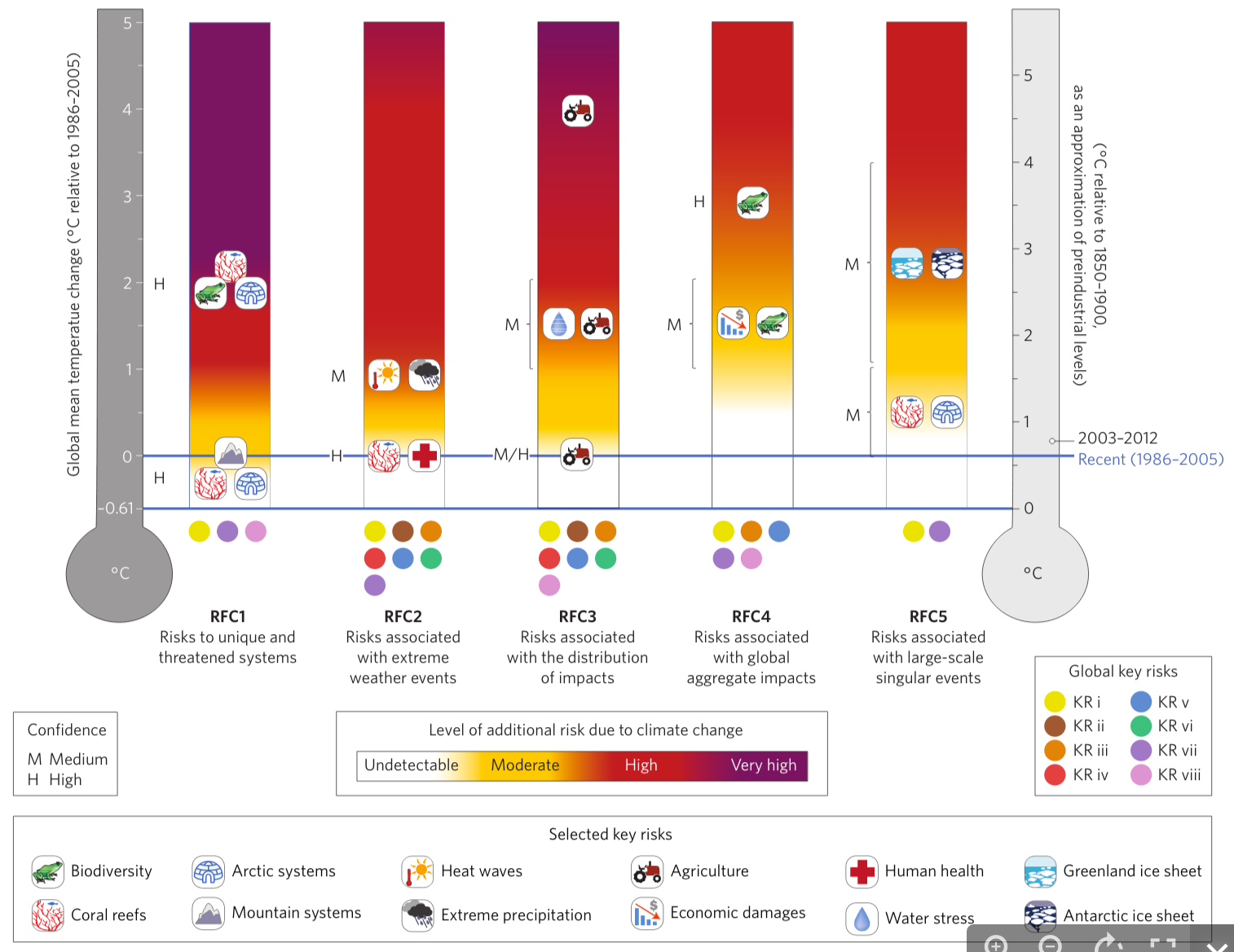
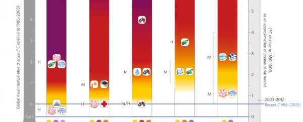
What we're looking at here is an updated version of the famous 'burning embers' graph released by the Intergovernmental Panel on Climate Change back in 2001.
In a new paper, 17 researchers examined that graphic, and updated it with the latest science. The result is the image above, which you can also see high-res version of here.
The graph shows how five key factors will be affected in response to rising temperatures.
The thermometer on the left shows the temperature relative to the period between 1986 and 2005 - pretty recent temperatures.
On the right, the thermometer shows pre-industrial level temperatures.
As you can see on the right, between 2003 and 2012, we're already up slightly on the recent temperature estimate, and we're nearly a whole degree above pre-industrial levels.
The bars on the graph then show five different "reasons for concerns" and shows how much of an additional risk climate change adds to each.
So, for example, there's:
- Risks to unique and threatened systems (endangered animals and ecosystems)
- Risks associated with extreme weather events (floods, heat waves, storms, hurricanes)
- Risks associated with the distribution of impacts (this reflects the fact that some groups will be hit harder than others, depending on where they live or their socioeconomic status)
- Risks associated with global aggregate impacts (anything that can be measured globally, such as lives lost, monetary damage, species at risk)
- Risks associated with large-scale singular events (there are all those tipping points we keep talking about. For example, if the West Antarctic ice sheet does collapse, or if the North Pole melts for good).
Purple indicates very high additional risk due to climate change in each of those bars, while white is undetectable, and yellow is moderate. Red is a high risk.
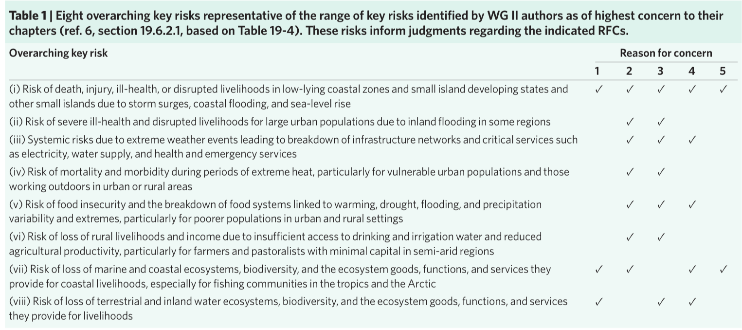
Within each bar are some specific risks that the team have highlights, which correlates to a key down the bottom. So you've got things like coral reefs, biodiversity, and arctic systems (all in the purple if we hit 2 degrees above 1986 to 2005 temperatures) and agriculture and human health.
The letter next to each of those little diagrams reflects how confident scientists feel predicting that risk. H is high, M is medium.
Those little coloured circles down the bottom correspond to different reasons for concern, which are explained here:
RFC 4 and 5 might seem a little less immediately obvious compared to risks to species and risks of extreme weather events, but those are the ones we should really be worried about, because they signify global change.
So scientists are only "medium confident" about it, but they predict that if we get to more than 2 degrees above 1986 to 2015 temperatures, the Greenland and West Antarctic ice sheets will be lost. Which will mean huge sea level rise that will affect the entire planet.
It's a pretty scary graph to look at once you know what it says - even at today's temperatures, agriculture, mountain systems, and coral reefs are suffering.
But with scientists saying we're now past the point of no return with climate change, it's probably time we all stop hand-wringing and take a good hard look at what's in store for the planet. Because the only way to get through it will be to know what to expect.
The study has been published in Nature Climate Change.
H/T: Vox