Last Thursday, social studies teachers in Boston's public schools ditched the widely used - but horribly distorted - Mercator Projection map in favour of a more accurate depiction of the world's landmasses.
The move puts an end to more than four centuries of misleading representations of the world, because the map you're used to seeing on the news and in atlases makes South America look like it's the same size as Europe - when it's almost twice as large - and Greenland looks equal to Africa, when it's actually 14 times smaller.
The shift towards the more accurate Gall-Peters Projection sees Boston's public schools follow the lead of the United Nations, which has advocated the map as a more 'fair', less Eurocentric representation of the world, as have several aid agencies.
And while some individual schools across the United States have already made the switch, Boston is thought to be the first public school district in the country to make it official.
Teachers in the 2nd, 7th and 11th grades have already received their new maps, and say the reaction from their students has been fascinating.
"[It was] interesting to watch the students saying 'Wow' and 'No, really? Look at Africa, it's bigger'," Natacha Scott, director of history and social studies at Boston Public Schools, told The Guardian.
"Some of their reactions were quite funny, but it was also amazingly interesting to see them questioning what they thought they knew."
For a bit of history on why we all ended up with an oddly distorted map, the Mercator projection was first depicted by Flemish geographer Gerardus Mercator, back in 1569.
Widely accepted as the best map for navigational purposes, it also became the norm for classrooms, atlases, and news broadcasts, but with it came some old-fashioned bias.
The benefit of the map was that it made colonial trade routes easier to navigate because it prioritised straight lines of travel, but in the process of trying to depict a round planet on a flat surface, land masses were distorted.
And being European, Mercator put western Europe in the very centre, and depicted North America and Europe as physically bigger than South America and Africa, which isn't the reality - the African continent is actually three times bigger than North America.
It also makes the Northern Hemisphere's landmasses look much bigger than the Southern Hemisphere's, when the Southern Hemisphere is around 100 million square km (38.6 million square miles) - roughly twice the size of the Northern hemisphere, at 49 million square km (18.9 million square miles).
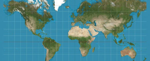
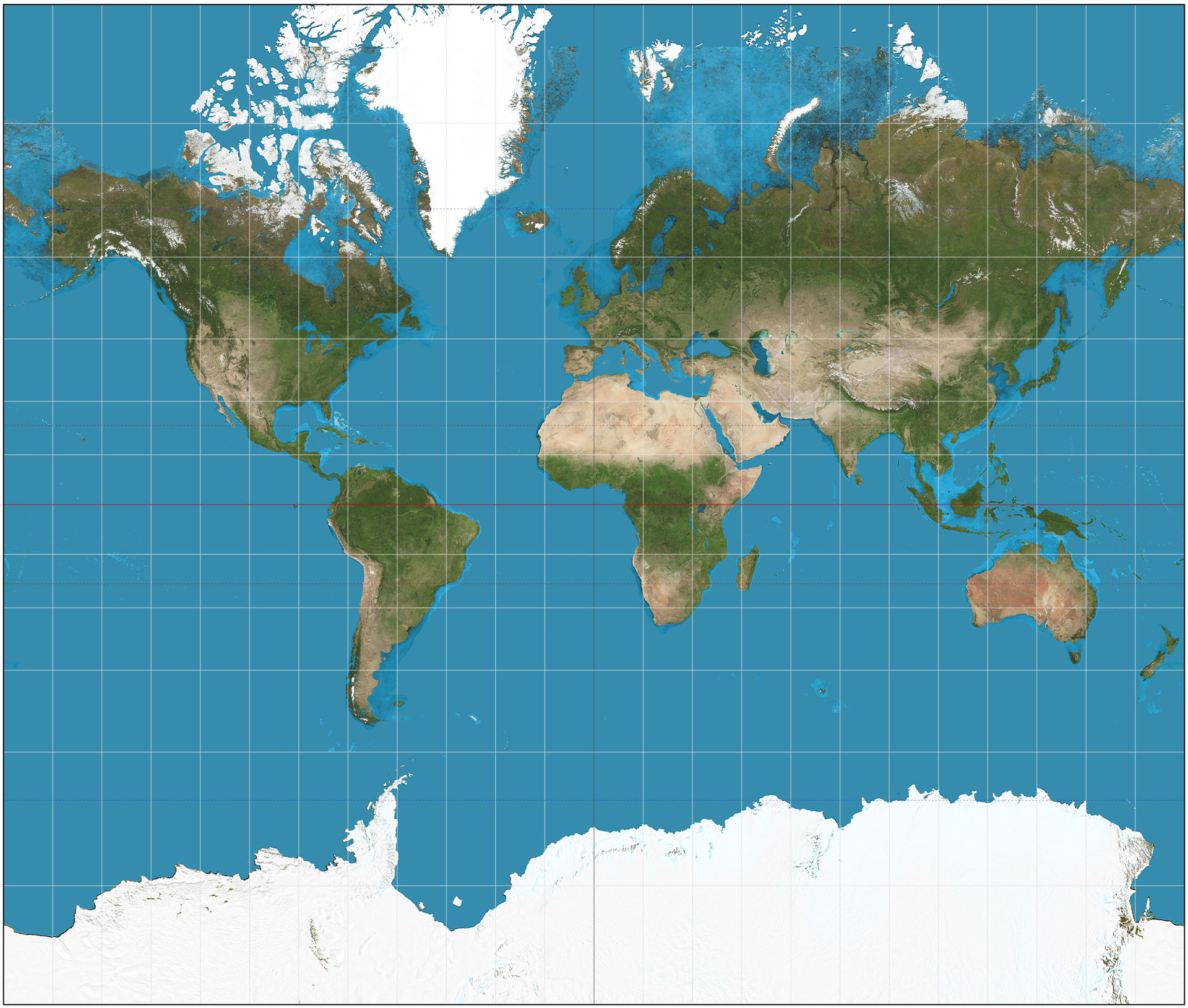
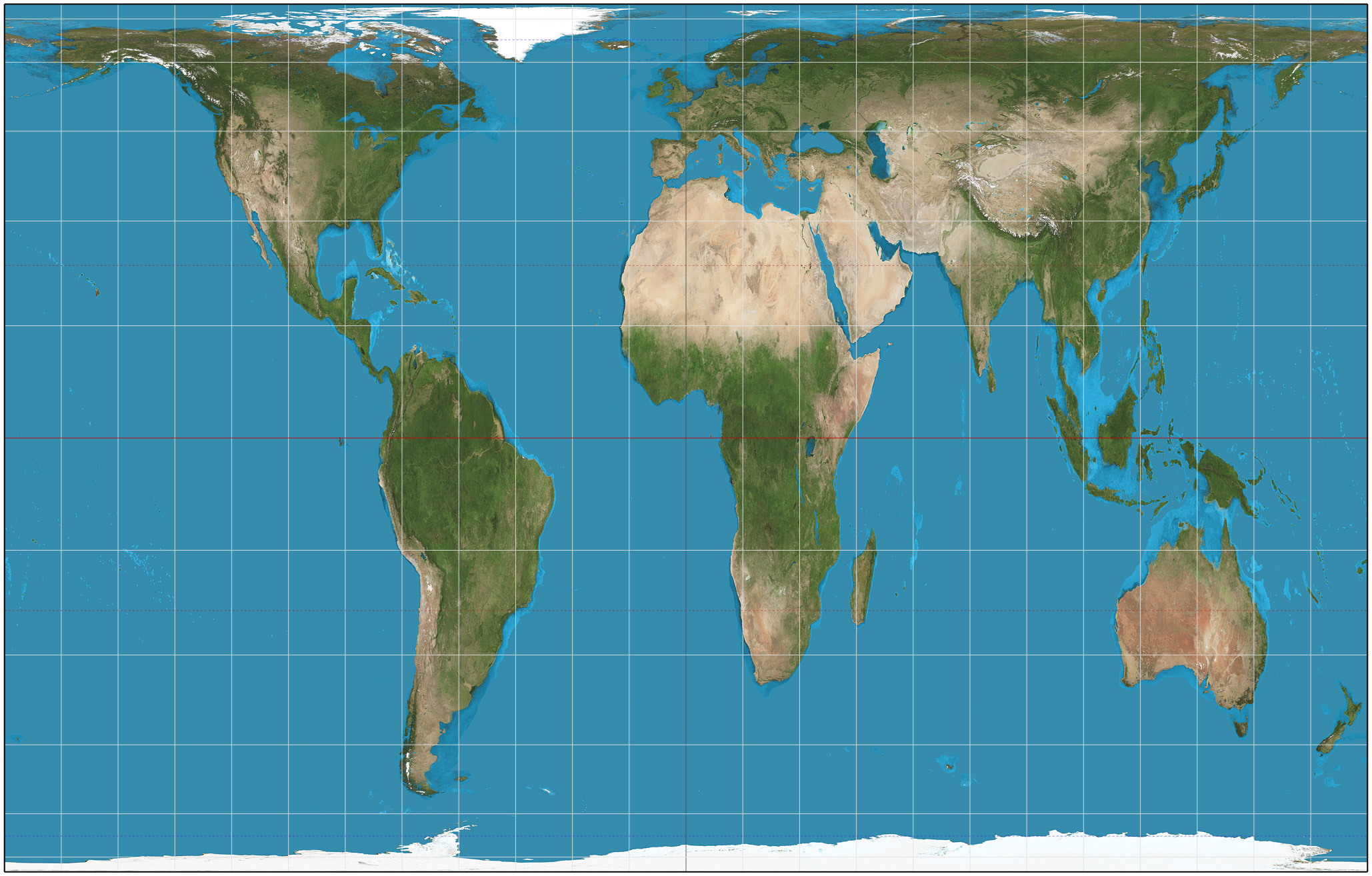
Here's a comparison of the two, with the Mercator Projection below:
 Strebe/Wikimedia
And the Gall-Peters Projection:
 Strebe/Wikimedia
And if you want an even better idea of how huge Africa really is, check this out.
Boston Public Schools officials say it's not just about showing their students the true sizes of the continents - it's about setting right the misconceptions set by colonialist agendas almost 500 years ago.
"Eighty-six percent of our students are students of colour," Hayden Frederick-Clarke, director of cultural proficiency for Boston Public Schools, told WBUR, Boston's NPR news station.
"Maps that they are presented with generally classify the places that they're from as small and insignificant. It only seems right that we would present them with an accurate view of themselves."
Presented at a conference in Germany by historian Arno Peters in 1974, the Gall-Peters Projection is not without its own controversy, because while Peters claimed to invent it, an identical map made by 19th century clergyman, James Gall, was discovered soon after.
And while this map does give a more accurate representation of the scale of the world's landmasses, it has its own distortions too, because it's really hard to fit a sphere onto a flat surface without warping certain features.
But it's a start, say the Boston teachers.
"Maybe we can be an example for other school districts," Colin Rose, assistant superintendent of opportunity and achievement gaps for Boston Public schools, told The Guardian.
"The Mercator projection is a symbolic representation that put Europe at the centre of the world. And when you continue to show images of the places where people's heritage is rooted that is not accurate, that has an effect on students."
And if you're looking for something even more 'out of the box' when it comes to maps - check out this amazing world map by Japanese designer and architect, Hajime Narukawa, which has been converted from a sphere to a tetrahedron, and finally to a flat surface.
Finally, because we all need more C. J. Cregg in our lives, here's The West Wing on the Gall-Peters Projection:
