We've all looked at enough maps in our lifetime to have a pretty good understanding of the size of the continents and countries that make up our little planet. …Or, do we? These 9 animated maps by Business Insider put our oh-so-familiar land masses into a crazy new perspective, and it turns out that maybe our image of the globe isn't so spot on after all.
For starters, everything might be bigger in Texas, but you might not be aware that you can fit the US state into the land mass of Greenland THREE times.
That's impressive, right? But then how about this? China could swallow Greenland up four times and still have room left over.
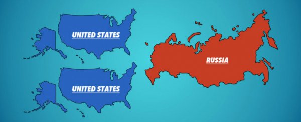
The US also isn't as big as you might think, fitting snuggly into Russia two times over. But I guess you might expect that, seeing as Russia's the biggest thing on the map, right?
Nope. That's probably the biggest mind-screw in all of this. Africa, which you would think wasn't anywhere near the size of Russia, is actually… well we won't spoil it for you, you should check that out for yourself above.
Once you've come to terms with having your world view rearranged, the good news is that there's a scientific reason for why we've been underestimating the African continent - and many of the other land masses on the planet: our maps are seriously deceptive.
That's because of something known as the Mercator projection, which was a cylindrical map projection invented back in 1569 to help nautical travellers work out their 'true' direction on the planet. And it's what we still use to create the large majority of the maps around our schools and in books today.
As Bec Crew explained for us last year:
"Any of the straight lines on the map are a line of constant true bearing, so all a navigator needs is one of these maps and a compass to plot a straight course across the ocean. The meridians are drawn as equally spaced, parallel vertical lines, as are the lines of latitude, but horizontally. The further away from the Equator they are, the further away they're spaced apart in the map.
This means that landmasses that are located far away from the Equator look disproportionately huge compared to their Equator-hugging neighbours."
In other words, if you're at the top or bottom of a map (hello, Antarctica), you're going to look a lot bigger and more spread-out than you would if you were located near the middle.
So it's not our fault that we've been underestimating Africa this entire time while telling everyone how giant Russia is. We've just been lied to through maps… I hate it when that happens.
Oh, and if you really want to trip yourself out, check out what the view across your closest ocean really is, because I can almost guarantee it's not what you think it is. My head hurts.