Anyone lucky enough to have grown up near the coast has probably spent countless hours staring off into the distance, trying to pick out an impossibly far-off landform on the horizon. And, for good reason, most of us assume that the land we're trying in vain to spot would be the next closest continent on the map - so as a Sydney-sider, I'd always thought I was gazing out somewhere towards New Zealand's North Island.
Well, prepare to have your world-view blown wide open by these incredible maps created by cartographer Andy Woodruff, because not only is your beach almost definitely not directly opposite whichever coastline you thought it was looking over, your assumptions are probably also way, way off.
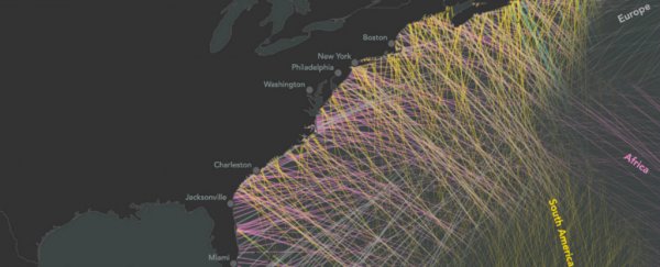
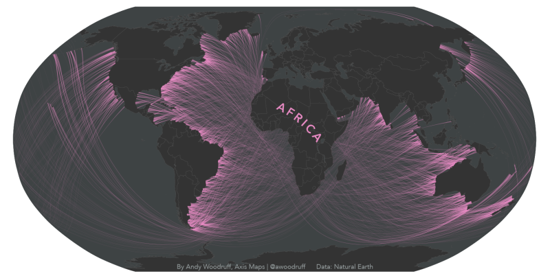
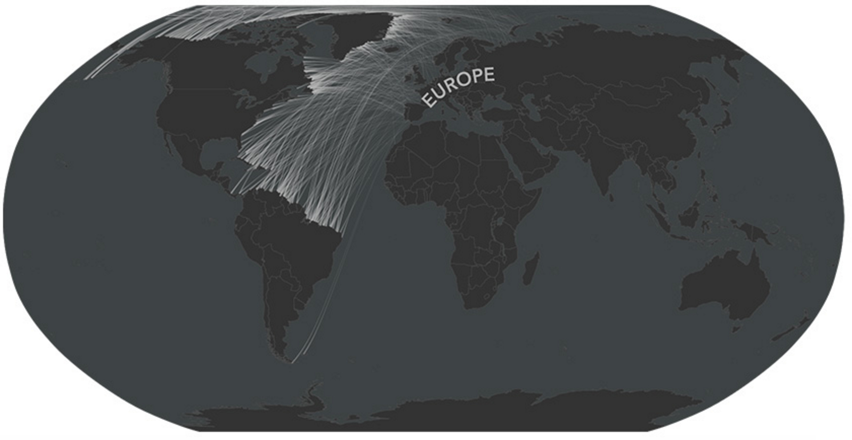
For example, if you're living on the east coast of the US, you're more likely to be looking out over South America or Africa than Europe - despite how it looks on a regular map.
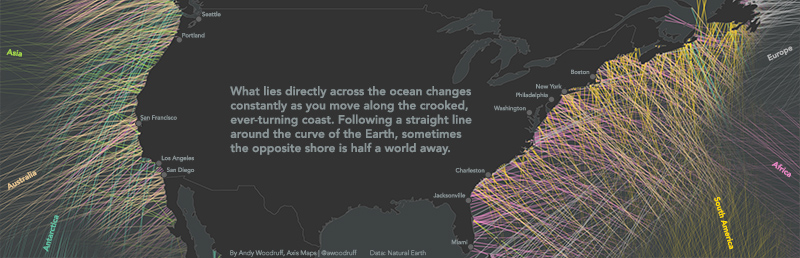
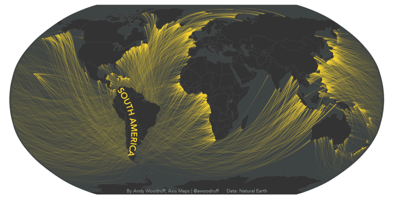
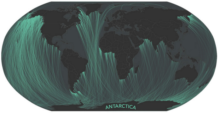
Vancouver Island locals? You're probably gazing at Antarctica. And if you live in a town called St Anthony in Newfoundland, Canada, you might assume you're looking across to Greenland and Iceland, but you're actually staring at a very, very distant Australia. Those of us in Sydney are bypassing New Zealand altogether and staring across to the US's west coast.
Of course, we all know - or at least we hopefully all know - that we live on a mostly spherical planet, and so it shouldn't come as a surprise that the rectangular maps we've grown up with aren't a true reflection of the world. But most of us are still pretty shocked when we really think about the countries and cities that are on the same latitudes around the world, like Rhode Island and Spain.
And even though maps such as this one point out those latitude connections, figuring out your beach view isn't quite as straightforward as that either, because it's not only the curve of Earth's surface that's warping our perception when it comes to our view across the water - we also have twisty-turny coastlines to deal with, and their effect is probably a lot greater than you might expect.
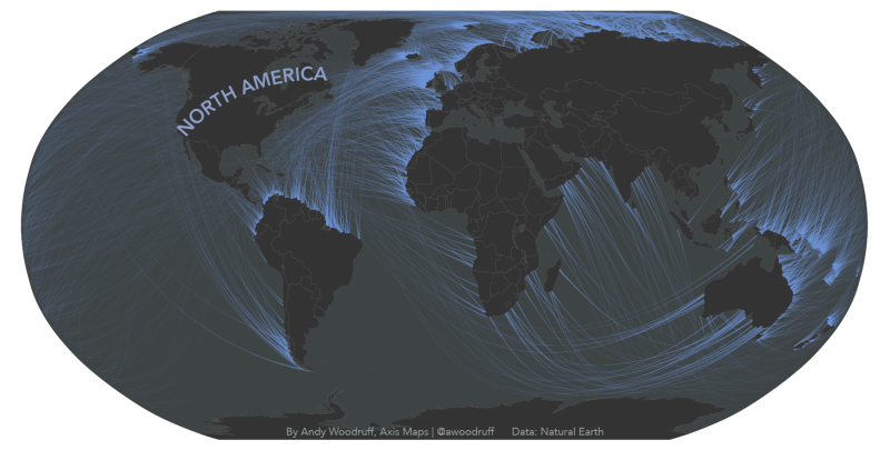
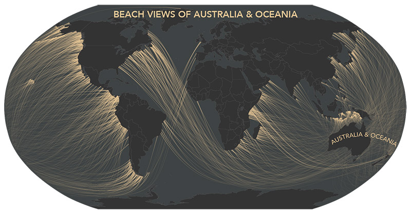
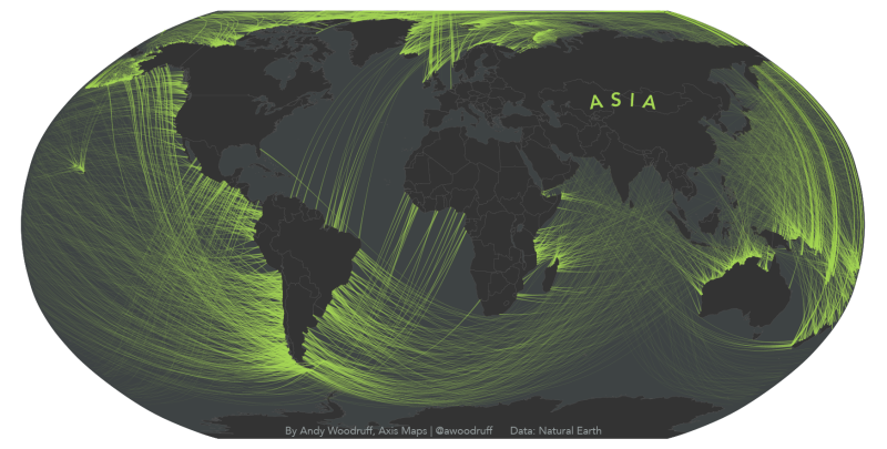
Thankfully, Woodruff's 'Beyond the Sea' collection of maps have been created to help show us the truth by using coloured lines to connect what's directly across from a coastline - the brighter spots show the origin of the viewer, and the lighter points they're connected to represent their view. The results might surprise you.
To create the maps, Woodruff first had to figure out which way each coastline in the world was facing on a pretty fine scale, which he did by using Natural Earth data.
He then had the slightly harder task of trying to work out what was in a straight line directly across from that coastline. In other words, if you're "standing on a given point and facing perpendicular to the coast, if you went straight ahead, never turning, where would you end up"?
That's not as straightforward as simply following lines of latitude, as Woodruff explains over on his site:
"If you can detach the concept of 'direction' from the concept of east and west, and look at globes and other map projections, it's easy enough to picture. The shortest, straightest line on a sphere (let's call Earth a sphere even though it technically isn't) is a great circle arc, not something like a line of latitude."
Woodruff did this for coastlines on every continent on Earth, and then drew colourful lines between the coastlines.
The claims made in the maps haven't been peer reviewed, and Woodruff admits the maths might not be perfect, but it's a pretty well-reasoned and solid attempt at calculating the view from coastlines around the world. And it's certainly a lot more accurate than our imagination.
H/T: Gizmodo