NASA and the US National Oceanic and Atmospheric Administration (NOAA) confirmed this week that 2016 really was the hottest year on record… again.
That might not seem so alarming - after all, climate and weather trends come and go. But the reality is that, regardless of how much the planet's temperature has changed over its 4.5 billion years of existence, it's nothing compared to what we've seen in the past century.
XKCD made that abundantly clear with this incredible infographic that takes a big-picture view of climate change throughout human history.
But a timeline is one thing - it's another thing entirely to see that average temperature creep up and creep up, year-on-year, in this stress-inducing 20-second time-lapse, released by NASA last week:
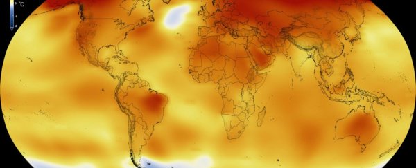
The data in the video above goes back to 1880, when we began collecting temperature records - culminating at today's 6,300 weather stations, ship- and buoy-based observations, and Antarctic research stations.
Until around the 1970s, you can see that the temperature fluctuates much like you'd expect, with the oranges and reds reflecting warmer temperatures, and the blues showing cooler years.
But from the 1980s onwards, there's very little blue left on the globe, and it's slowly covered in orange, yellow, and red, taking us right through to 2016.
The reference thermometer you can see in the top left-hand corner reflects the temperature difference (in degrees Celsius) between each year, and the mid-20th century mean - the '0' on the scale.
By the end of last year, the average temperatures around the planet were creeping up to almost 1 degrees Celsius (1.8 degrees Fahrenheit) higher than that reference point.
"2016 is remarkably the third record year in a row in this series," said Gavin Schmidt, director of NASA's Goddard Institute of Space Studies. "We don't expect record years every year, but the ongoing long-term warming trend is clear."
As you can see in the visualisation, not all of that warming happens across the planet at the same time, thanks to weather phenomena such as El Niño or La Niña.
For example, 48 states in the US experienced 2016 as only the second hottest year on record, but the Arctic experienced its warmest year ever, with record low sea ice coverage to match.
If a video isn't really your thing, NASA also released this gif showing the year-on-year increases. If it's not moving, you can see it in action here:
Either way you look at it, we're in a period of unprecedented global warming. So we'd better learn how to cope with rising temperatures, fast.