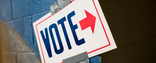
The typefaces you see on yard signs and bumper stickers might hold a hidden meaning for voters.
A new psychological study suggests some typefaces read more conservative, or right-leaning, while others come across as more liberal, or left-leaning.
In two different surveys, the authors identify four font changes that seem to convey ideological qualities.
Gothic-looking typefaces with serifs, for example - which are slight projections finishing off the stroke of a letter - were generally considered more conservative than those without serifs, while bolded messages were deemed more conservative than italicised ones.
"This study shows that font plays a role in American political communication, conveying ideology through the anatomy of its letterforms," says Katherine Haenschen.
"Through this research, we lay the groundwork for future studies that may identify relationships between fonts and persuasive outcomes in political communication."
The idea that typefaces can act as mirrors, reflecting our own ideological qualities is nothing new. Past research has shown that certain styles carry different personality attributes.
For instance, in one recent experiment, 45,000 online readers were given a New York Times article about a scientific study comparing optimism to pessimism and were asked whether they believed the conclusion.
The article was presented in several different typefaces, including Baskerville, Comic Sans, Computer Modern, Georgia, Helvetica and Trebuchet, to see if that played a role in perceived credibility.
In the end, Baskerville was deemed the most trustworthy, while Comic Sans was practically the laughing stock of the lot.
Another analysis shows satirical readings are funnier and angrier in Times New Roman than in Arial.
"Though typefaces can express "values such as association, style, identify, differentiation, and beauty" in addition to the encoded textual meaning, what is yet unknown is whether people perceive typefaces through a political lens," the authors write.
Their new study is an exploration of that very idea. In survey number one, 987 respondents were given the phrase "the quick brown fox jumped over the lazy dog", written using either serif or sans serif typefaces, or regular, bold and italic styles.
Respondents then rated what they saw as either liberal or conservative, and the serifs on the Times New Roman typeface were generally seen as more right-leaning.
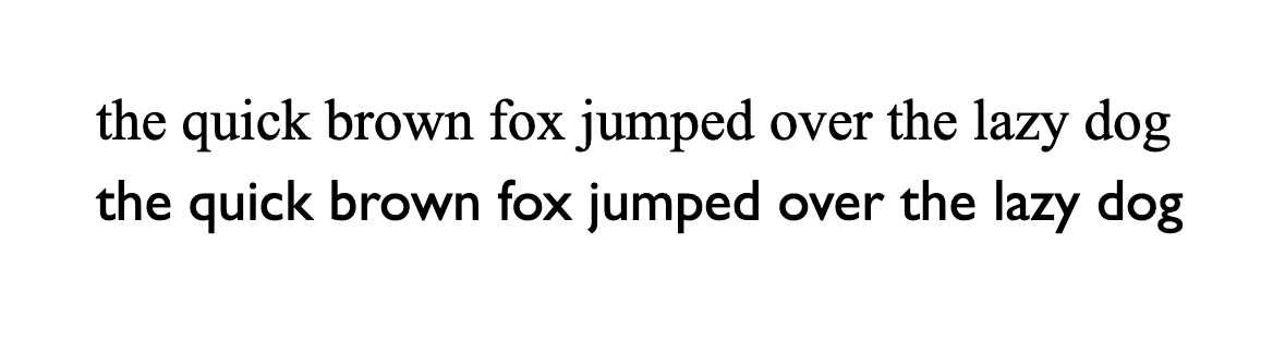 Times New Roman font on top, Gill sans on bottom.In the second survey, six different typefaces were used, and participants read either a phrase or just a simple name.
Altogether, the effect sizes were relatively small, and depending on the typeface examined the results were quite variable. On the whole, however, the authors report that bolder, thicker letterforms are seen as more conservative and italicised letterforms as more liberal.
"There was no significant difference in ideological perceptions of a typeface when it was used to render a name or a phrase, suggesting these effects may be an attribute of the typeface itself," the authors write.
"We also find evidence that partisanship moderates ideological perceptions of fonts, with both Republicans and Democrats rating fonts in an ideologically congruent manner."
The methods used here are quite limited, and there's only weak evidence that a person's ideology can influence whether they look upon a font favourably or not. Nevertheless, the authors say there's enough of a relationship to warrant further research.
"While it is perhaps not a surprise that typefaces are viewed as liberal or conservative given the other qualities that have been ascribed to them," they write, "the degree to which subjects' own partisanship influences their perception of typefaces and whether or not they like them suggests that typographical design choices may have consequences for how political messages are received."
The study was published in Communication Studies.