In presentations of global warming, sometimes watching maps morph from blue (cold) to red (hot) grows tiresome. Talented data visualizers are finding new and creative ways to illustrate the warming of the planet.
The latest visualization of Earth heating up was built by Antti Lipponen, a research scientist at the Finnish Meteorological Institute, and it has caught fire. Just since Saturday, it has been shared 16,000 times on Twitter.
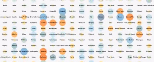
It reveals the majority of countries have warmed by at least one degree Celsius (1.8 degrees Fahrenheit), and all but one (Kiribati) have warmed by at least 0.5 degrees (0.9 degrees Fahrenheit) since the late 1800s.
Maddie Stone, managing editor at Earther, aptly described the visualization as a "climate switchboard".
Lipponen's creation shows temperature trends for 191 countries over a rectangular grid.
Each country is represented by a circle. The size of the circle indicates how much the temperature has changed relative to the average temperature between 1951 and 1980, using NASA data.
Colors are used to illustrate whether it's warming or cooling. Warming temperatures follow a gradient from orange to red based on intensity, while circles that show cooling are filled in shades of blue.
The visualization is an animated time series that spans 1880 and 2017.
When you set the animation in motion, the switchboard - to borrow Stone's description - is initially filled with an array of blue lights, indicating cool temperatures, but they gradually fade away by the 1970s as Earth warms.
By the 2010s, the switchboard becomes flush in big orange and red flashing lights, as if to yell "caution" or even "stop!"
The red circles convey at least two degrees Celsius (3.6 degrees Fahrenheit) warming, which some equate with dangerous interference with the climate system.
"No matter how you visualize it, it looks scary!," Lipponen wrote in his tweet unveiling the switchboard.
Lipponen presented this same data a year ago using a different visualization style, in which each country's temperature relative to normal is a spoke that extends from a wheel and expands outward with time as the climate warms.
This tweet has been shared over 10,000 times.
Twitter has turned into a treasure trove for stellar climate visualizations that lucidly illustrate the unambiguous warming of the Earth's climate.
Below you can find several we have featured in the past:
This summer's record heat, day by day, May through July.
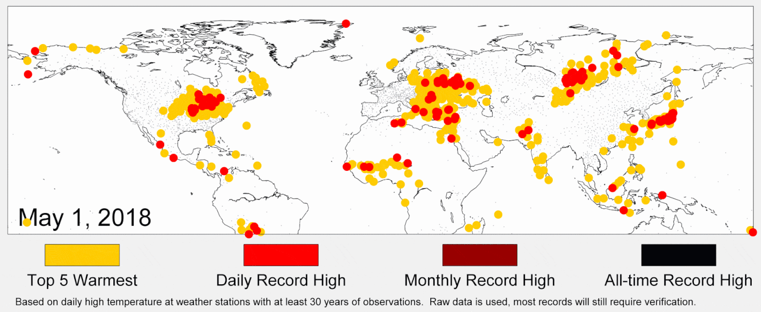 (Robert Rhode/Berkeley Earth)
Climate change in the United States presented in 123 red, white and blue stripes.
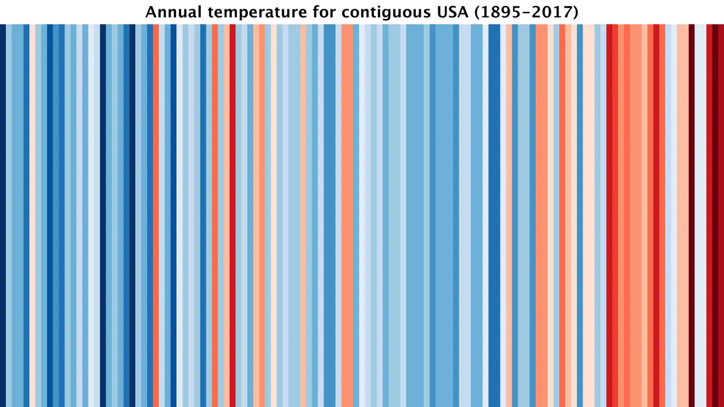 (Ed Hawkins)
Unraveling spiral: The most compelling global warming visualization ever made.
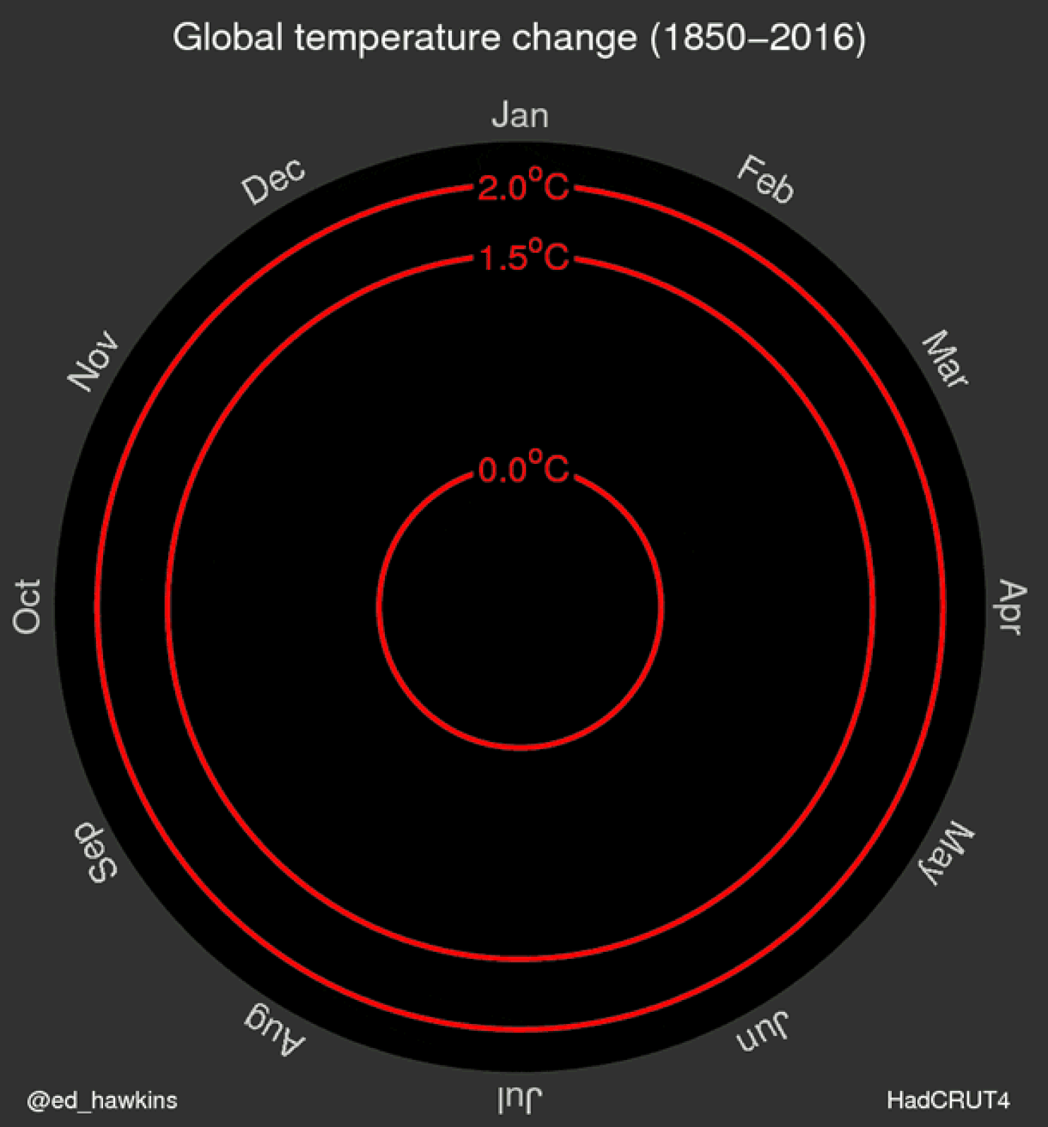 (Ed Hawkins)
Below find two additional excellent visualizations of climate data posted to Twitter this month, which we have not shared before, by Patrick Brown, a climate scientist at the Carnegie Institution for Science.
The first puts both recently observed climate warming and projections for the future in a long-term historical context, dating back 20,000 years:
Contemporary Global Warming placed in geological context. https://t.co/DMuiKptjPi pic.twitter.com/WI4jRQhrs4
— Patrick T. Brown (@PatrickTBrown31) August 20, 2018
The second shows that not only has the recent temperature rise correlated with increases in atmospheric carbon dioxide, but also that computer models dating back to the 1980s have correctly predicted the warming.
"It’s difficult to make predictions, especially about the future." That's why it's important that the connection between CO2 and global temperature is not only supported by present "predictions" about the past, but also by past predictions about the present: pic.twitter.com/JatWKoZiDK
— Patrick T. Brown (@PatrickTBrown31) August 26, 2018
2018 © The Washington Post
This article was originally published by The Washington Post.