A new interactive map created by Facebook shines a new light on the spread of the coronavirus: Rather than showing the number of people who have tested positive for COVID-19, it shows how many people have reported symptoms in a US county.
The map uses data from a survey of over 1 million Facebook users conducted by Carnegie Mellon University researchers over two weeks, Facebook said in a statement.
CEO Mark Zuckerberg said Facebook's user base of 2 billion people positioned it to help researchers conduct sweeping surveys to better understand the COVID-19 outbreak.
"Facebook is uniquely suited to run these surveys because we serve a global community of billions of people and can do statistically accurate sampling," Zuckerberg wrote in a blog post on Monday morning.
"We do this in a privacy protective way where only the researchers at Carnegie Mellon see individual survey responses – and Facebook only sees aggregated data."
Facebook said it would continue carrying out daily surveys to keep the map updated. While the map reflected only US counties on Monday, the company said it would start running surveys globally in the coming weeks.
Zuckerberg said the data gathered from Facebook users could help health authorities and governments decide how and when to reopen certain parts of the world in the coming months.
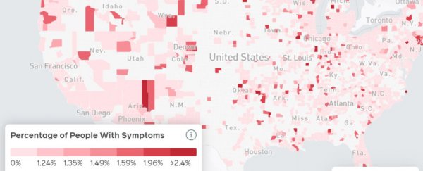
Here's how the map works.
The map shows a county-by-county breakdown of how many surveyed Facebook users reported COVID-19 symptoms. You can also compare that with a map of Facebook users who reported flu symptoms in the county.
The map can also sort data by "hospital referral regions," which could indicate which areas' hospitals are poised to face the heaviest burden.
 (covid-survey.dataforgood.fb)
The interactive map lets you zoom in to view data at the county level.
Take a look at Facebook's COVID-19 map here.
This article was originally published by Business Insider.
More from Business Insider: