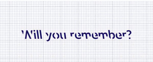
A new font can help lodge information deeper in your brain, researchers say, but it's not magic - just the science of effort.
Psychology and design researchers at RMIT University in Melbourne created a font called Sans Forgetica, which was designed to boost information retention for readers.
It's based on a theory called "desirable difficulty", which suggests that people remember things better when their brains have to overcome minor obstacles while processing information.
Sans Forgetica is sleek and back-slanted with intermittent gaps in each letter, which serve as a "simple puzzle" for the reader, according to Stephen Banham, a designer and RMIT lecturer who helped create the font.
"It should be difficult to read but not too difficult," Banham said. "In demanding this additional act, memory is more likely to be triggered."
In designing Sans Forgetica, Banham said he had to override his instincts, ingrained from 25 years of studying typography. Clarity, the ease of processing and familiarity are usually guiding principles in the field.
The back-slanting in Sans Forgetica would be foreign to most readers, as back-slanting in type is typically only used by cartographers to indicate rivers. The openings in the letters make the brain pause to identify the shapes.
The team tested the font's efficacy along with other intentionally complicated fonts on 400 students in lab and online experiments and found that "Sans Forgetica broke just enough design principles without becoming too illegible and aided memory retention," according to a news release on the university's website.
In some ways, Sans Forgetica is a continuation of work by Daniel Oppenheimer, a Carnegie Mellon psychology professor who presented a similar idea about "desirable difficulty" called "disfluency" while doing work at Princeton University in 2011.
The terms are different, but the principle is the same: minor mental gymnastics help readers remember things better.
Oppenheimer's team relied on contrast and size for the mental hurdles rather than on a foreign font. In one experiment, the team had 28 college students read information about two made-up creatures, the pangerish and the norgletti.
The pangerish information was printed in gray, 12-point Comic Sans or Bodoni fonts. The norgletti profile was printed in 16-point, plain, black Arial font.
The team distracted students for 15 minutes after they read about the animals, then quizzed them; the students remembered 87 percent of the pangerish facts, whose information had been tougher to read, and 73 percent of the norgletti facts.
Oppenheimer and his team expanded their research over the course of a semester at a high school in Chesterfield, Ohio. They changed the fonts on teaching materials - handouts, PowerPoint slides and worksheets - in several classes and subjects to uncommon ones, such as italicized Comic Sans, Monotype Corsiva and Hattenshweiler.
After several weeks of instruction, researchers found that in all subjects except chemistry, students who had read the "disfluent" materials performed far better on assignments.
"This research shows that behavioral interventions can be an important element in school reform," Oppenheimer said in an interview with Harvard Business Review.
Sans Forgetica is the first font created with retention in mind, the researchers at RMIT said. But Janneke Blijlevens, another researcher on the project, stressed that the font should be used sparingly for it to stay effective.
If the reader's brain gets too comfortable, it will glaze over Sans Forgetica just as easily as if it were Arial or Times New Roman, some of the world's most ubiquitous fonts.
"We believe it is best used to emphasize key sections, like a definition, in texts rather than converting entire texts or books," Blijlevens told The Washington Post.
Want to test it for yourself? Sans Forgetica is available as a Google Chrome extension through an RMIT website.
2018 © The Washington Post
This article was originally published by The Washington Post.
