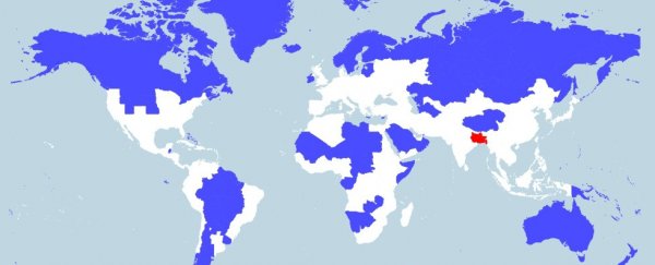
This mind-blowing map was created by self-confessed data-cruncher Max Galka, and shows two different areas that each house 5 percent of the world's population.
One includes several of the major OECD countries, such as Australia, Ireland and Canada, as well as nine US states. The other includes just one country - Bangladesh - and three eastern Indian states: Bihar, Jharkhand, and West Bengal. The remaining 90 percent of the world? Well, they're spread out across the remaining white area.
The map was created using open-source mapping tool QGIS, and is an updated version of one uploaded to Reddit a few weeks ago, after Galka found that its red area contained only 3 percent of the world's population.
His new version is based on population figures taken from the Credit Suisse Global Wealth Databook, and Galka told Robbie Gonzalez at io9 that he tried to include full countries in the shaded areas as often as possible, but occasionally had to use entire regions or territories to round the numbers out. You can see all data yourself over at Galka's website.
 Max Galka
While it's always fascinating to see the variation in population density around the world, this map is particularly thought-provoking because most of us will struggle to immediately identify the countries in the red zone.
"What I find most interesting is that such a dense population centre can be in a area that has so little global prominence," Galka told Gonzalez. "Bangladesh is the seventh most populous country in the world, but how many people could even locate it on a map?"
He also doesn't see population density as a negative thing, and hopes people don't take that message away from the map:
"If anything, I see South Asia's dense population as a positive thing. It is very efficient economically, socially, and environmentally for people to live in dense population centres. And a movement out of rural areas into cities is trend that is happening everywhere in the world, even in India and Bangladesh. So in that sense, they are ahead of the curve."
Find out more about how Galka created the map over at io9.