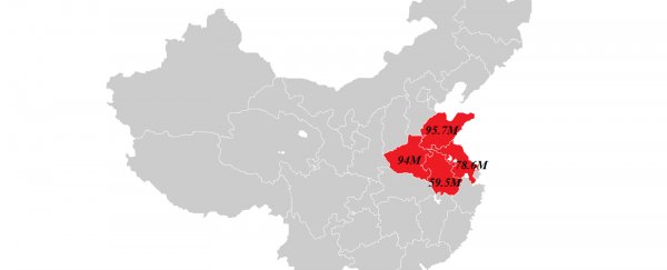
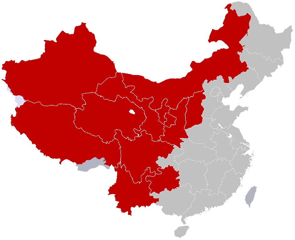
This fascinating map, created by redditor jackblack2323, shows just how densely populated some of China's most inhabited regions really are - the entire 316 million population of the US could live in just four of its provinces.
Despite the two countries having a similar land area, China's population is around four times larger than the United States.
But, as Robbie Gonzalez explains over at io9, this map provides a slightly skewed view of China's population density.
Yes, these four provinces of Shandong, Jiangsu, Henan and Anhui are extremely densely populated, but that's definitely not the case for the whole country.
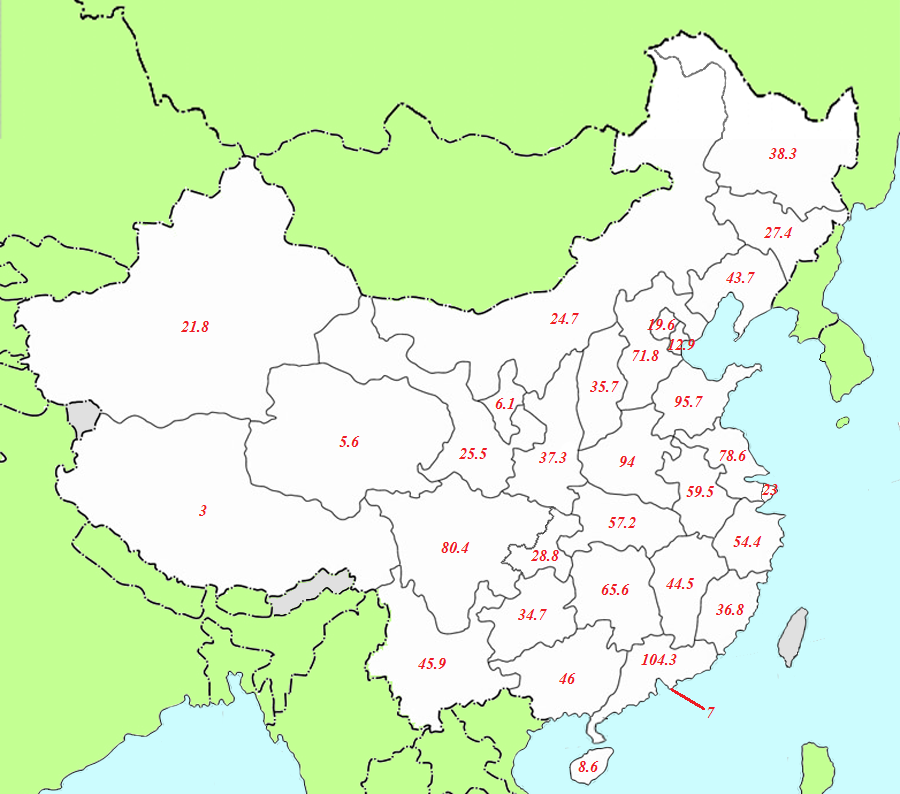
As you can see in the map below, also provided by jackblack2323, there are other less densely packed regions, such as Qinghai.
Around the world, this skew of population density is common, as Gonzalez explains.
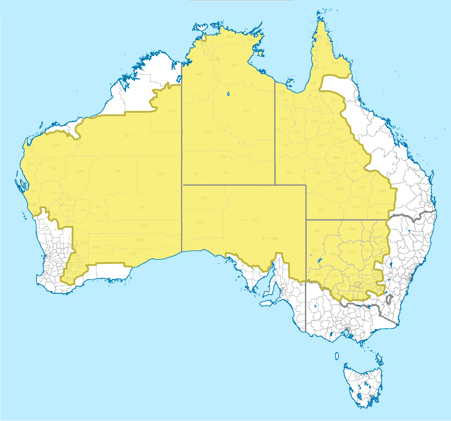
In Australia, only 2 percent of the population live in this area in yellow below - the rest of the 98 percent is crammed into the white areas around the outside of this map, which was created by redditor e8odie, and shared by io9.
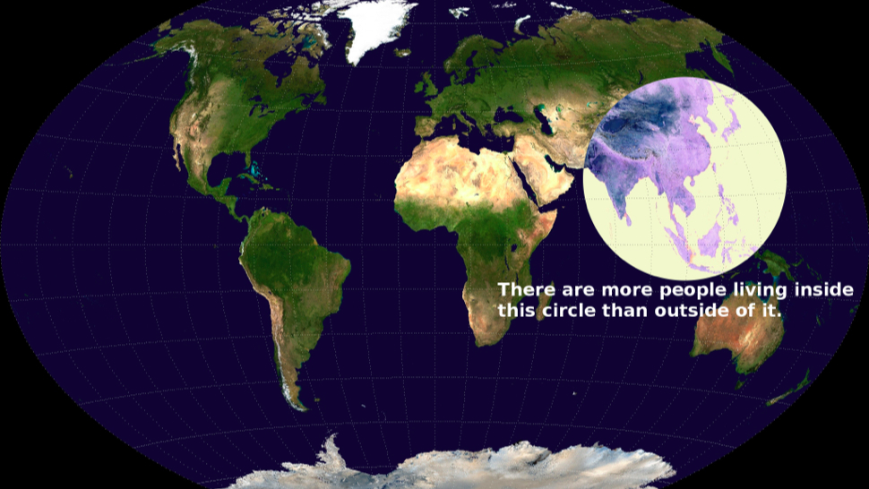
And globally, of course, more of the world's population live inside this circle than outside it, as this widely distributed map proves.
These maps all seem pretty mind-blowing… but are they really that surprising? As Gonzalez writes:
"Why does any of this matter? Because websites love to take maps like these and tell you that they'll CHANGE THE WAY YOU SEE THE WORLD, but what about the way you see the world is being changed by these maps, really? Comparisons like these are almost almost meaningless in the absence of some additional context."
This context, of course, includes factors such as available resources, housing, climate, environment and politics.
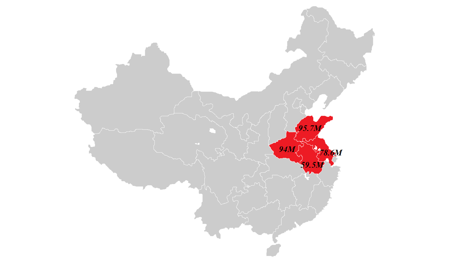
Just to show you some evidence, redditor gotrees created this map to show that the entire US population could also fit into these provinces of China, which isn't that shocking.
So while it's pretty cool to gain a little perspective on the world and how many people we have living in certain areas, it's also important to remember that there's always more to the story, and maybe that's even more fascinating.
Check out Gonzalez's story over at io9 to see more fascinating population maps - including one that shows the crazy population density skew in Iceland.
Source: io9