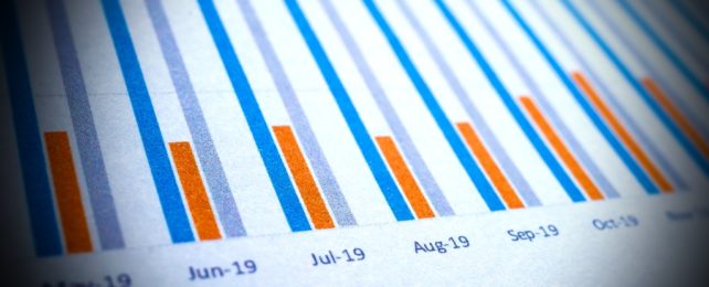
Bar charts and line graphs are both designed to help us visualize data. They are tools to convert numerical information into pictorial narratives that can be more easily comprehended. They don't change the data; they simply represent it.
They do represent it in different ways, however, and even those slight differences can be enough to bias us as we try to make predictions, according to a new study.
Researchers from the UK recruited more than 4,000 subjects over the internet, presented them with various graphs depicting past sales figures by a fictitious company, and asked them to predict future sales based on the trends so far.
Participants consistently made lower forecasts about how a trend in the data would develop when the data were presented in a bar chart, as opposed to the very same data being shown with either a line graph or unconnected points on a graph, the study found.
Graphs like these play key roles in society, points out lead author Stian Reimers, a behavioral scientist at City, University of London. As windows into complex data, visualizations help more people understand important issues – or at least that's the idea.
"In the past few years it seems like we have spent a lot of time looking at time series: whether it's the number of COVID-19 cases, electricity prices, or inflation rates, to try to work out what's coming next," Reimers says.
"What our research shows is that our predictions of what we think will happen next are affected not just by the trends we're looking at," he adds, "but the format in which they're displayed."
Reimers and co-author Nigel Harvey, a cognitive psychologist who studies judgment and decision making at University College London, recruited subjects using an internet rewards program, which incentivized participants to complete the two-minute online experiment and to make accurate predictions.
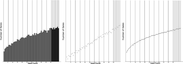
In the study's first two experiments, researchers gave the subjects a single graph – either a bar, line, or point graph – with 50 data points representing sales totals. Subjects could then click on the graph to record their prediction for the next 8 sales periods.
The first experiment featured a graph showing sales increases over time, which generally prompted subjects to predict continued success. The second experiment tried the opposite, with a graph showing decreases over time, and subjects responded with more pessimistic forecasts.
Across a variety of trends, subjects consistently made lower predictions about future sales when the same data were portrayed with a bar chart rather than a line or point graph.
In hopes of shedding light on why, the researchers tried adjusting the portrayal of the bars themselves. Maybe heavily shaded bars draw people's attention downward, biasing them just by associating the actual data points with the eye-catching shaded region below?
Yet subjects continued to lowball the bar graphs, the researchers found, even when the bars were left unshaded.
A final experiment proposed the bias might be reversible if bars emanate from the top of the graph rather than the bottom, but the findings were inconclusive, the researchers report.
The existence of this bias could cause problems in many ways, Reimers points out. It might lead people to misunderstand local COVID-19 or flu activity before visiting a vulnerable relative, for example, or to misjudge whether they can afford a mortgage.
Similar errors could have even wider ramifications in a business or public policy context, the researchers note, especially in situations where an individual "eyeballs" a graph to make rough estimates of what will happen next.
A bias like this could potentially be exploited to mislead people, although there are two sides to that coin. By understanding the bias and how it works, we might become better able to portray data accurately and help more of the general public understand it.
"A lot of the other biases that people show when trying to extrapolate trends are baked into the way we see the world and hard to change," Reimers explains.
"The format we use for our graphs is something we have complete control over, so it may be possible to use specific formats to help undo people's built-in biases and help people make more accurate judgments," he says.
The study was published in the International Journal of Forecasting.