For the average person, climate change is an abstract concept, an intangible truth, based on complex scientific data that is notoriously difficult to visualize.
Climate scientist Ed Hawkins is trying to change this. He's been developing unique ways to make climate change easier for the general public to imagine. And his newest project has got to be one of the most beautiful and powerful climate change visuals we've ever seen.
I mean, just look at it.
Visualising global temperature change since records began in 1850. Versions for USA, central England & Toronto available too: https://t.co/H5Hv9YgZ7v pic.twitter.com/YMzdySrr3A
— Ed Hawkins (@ed_hawkins) May 23, 2018
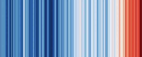
The arresting image removes all the scientific accessories, leaving only a color scale to represent an overall change of 1.35 degrees Celsius.
Starting with dark blue and ending in dark red, Hawkins creates a clear and terrifying translation of global warming using the UK's Met Office data from 1850 to 2017.
"I wanted to communicate temperature changes in a way that was simple and intuitive, removing all the distractions of standard climate graphics so that the long-term trends and variations in temperature are crystal clear," Hawkins told Earther.
"Our visual system will do the interpretation of the stripes without us even thinking about it."
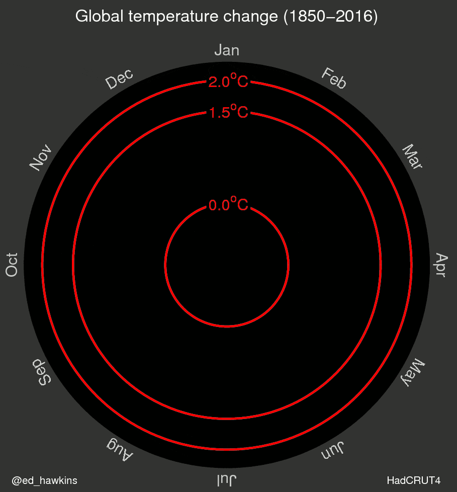
This isn't the first time Hawkins has done something like this. Two years ago, a spiral graph of global temperatures that he made went viral, simultaneously mesmerizing people and scaring the living day lights out of them.
"I wanted to try and visualize the changes we have seen in different ways to learn about how we might improve our communication," he told Gizmodo.
"The spiral appeared to present the information in an appealing and straightforward way. The pace of change is immediately obvious, especially over the past few decades. The relationship between current global temperatures and the internationally discussed target limits are also clear without much complex interpretation needed."
You don't say.
Now, Hawkins is creating similar color scale visuals for a variety of locations around the world. So far, he has annual temperatures in Toronto, in the contiguous USA and in central England. He says more are coming soon.
Annual temperatures in Toronto since 1841 pic.twitter.com/LWyyADKMhs
— Ed Hawkins (@ed_hawkins) May 22, 2018
Annual temperatures for the contiguous USA since 1895 pic.twitter.com/KXJ6JVBl0o
— Ed Hawkins (@ed_hawkins) May 22, 2018
Annual temperatures in central England since 1772 pic.twitter.com/gl7Sa7p6fY
— Ed Hawkins (@ed_hawkins) May 22, 2018
It's pretty darn obvious where we are headed.
Science AF is ScienceAlert's new editorial section where we explore society's most complex problems using science, sanity and humor.