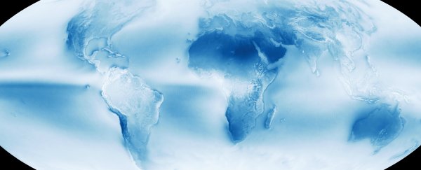
It's now a whole lot easier to pick the perfect place to live, thanks to this incredible NASA map showing the average cloud cover around the world. White indicates constant cloud cover, and dark blue represents hardly any, with the shades of blue signifying the coverage in between (see larger version here).
The map was compiled using 13 years of data taken by NASA's Aqua Satellite, which orbits Earth taking high-resolution images in order to monitor our planet's water cycle. And it shows a few very interesting things, including just how dry Antarctica really is.
It also reveals the band of deserts at roughly 30° north and south - the latitude that's home to the Sahara and the Kalahari. As Joseph Stromberg explains for Vox:
"These are the result of Hadley cells: winds patterns that blow dry, high-altitude air masses from the equator to the tropics, where they descend, sucking up moisture and preventing cloud formation.
On the flip side, the same patterns form a distinct band of cloudiness at the equator. Here, the same cells blow low-altitude, moist air. When it rises upward, it causes water vapour to condense into clouds."
If you look closely, you'll also see cloud patterns following mountain ranges, which push air upwards, where it cools and condenses.
Maps such as this one aren't just fascinating, they also show us how interconnected the weather systems around the planet are, and help us understand how our behaviour in one place can influence the climate somewhere else.
Phil Plait puts it best over at Slate: "Look again at that beautiful cloud map. That's home, and the only one we'll have for quite some time. The more we know about it, the more we understand its behaviour, the better."