Despite everyone's best intentions, not all marriages end in happily ever after. You go into it the union knowing the divorce rate is almost 50 percent in the US, but surely those numbers are for other people, and not you and the love of your life… right?
Scientists have now taken a little guesswork out of the equation for you by creating this interactive chart that shows your likelihood of getting divorced based on a range of demographics, including employment status, education level, and ethnic background. And depending on your situation, things are looking better than you might expect.
The chart was created by statistician Nathan Yau for FlowingData, and is based on data from the American Community Survey between 2009 and 2014.
The most interesting thing is that, despite the common stat floating around there that "one in two marriages end in divorce", the divorce rate for all of the demographic tabs never gets higher than 45 percent. That's because most people try to work out the percentage by simply dividing the divorce rate by the marriage rate, as Yau explains:
"For example, based on 2014 American Community Survey, 1-year estimates, there were 8.7 divorces and 17.0 marriages per 1,000 women. Divide the former by the latter and you get 51 percent. For men, it was 8.1 and 18.1, respectively, which gives you 45 percent. The problem with this math is that the people who marry now aren't the same people who divorce now. Claire Cain Miller for the Upshot discussed this a while back."
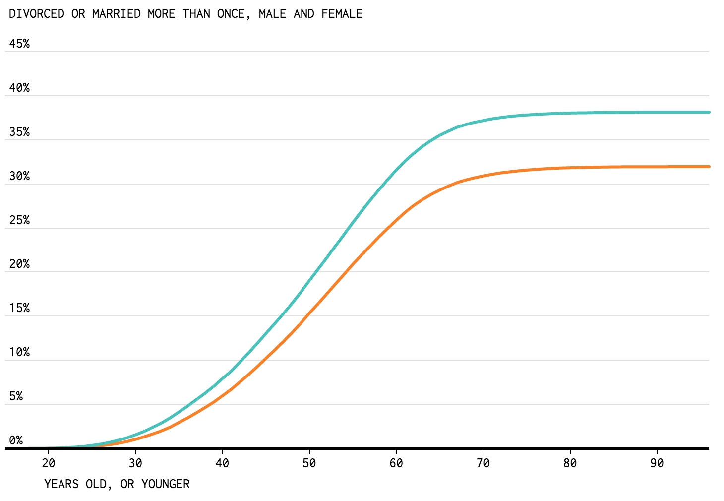
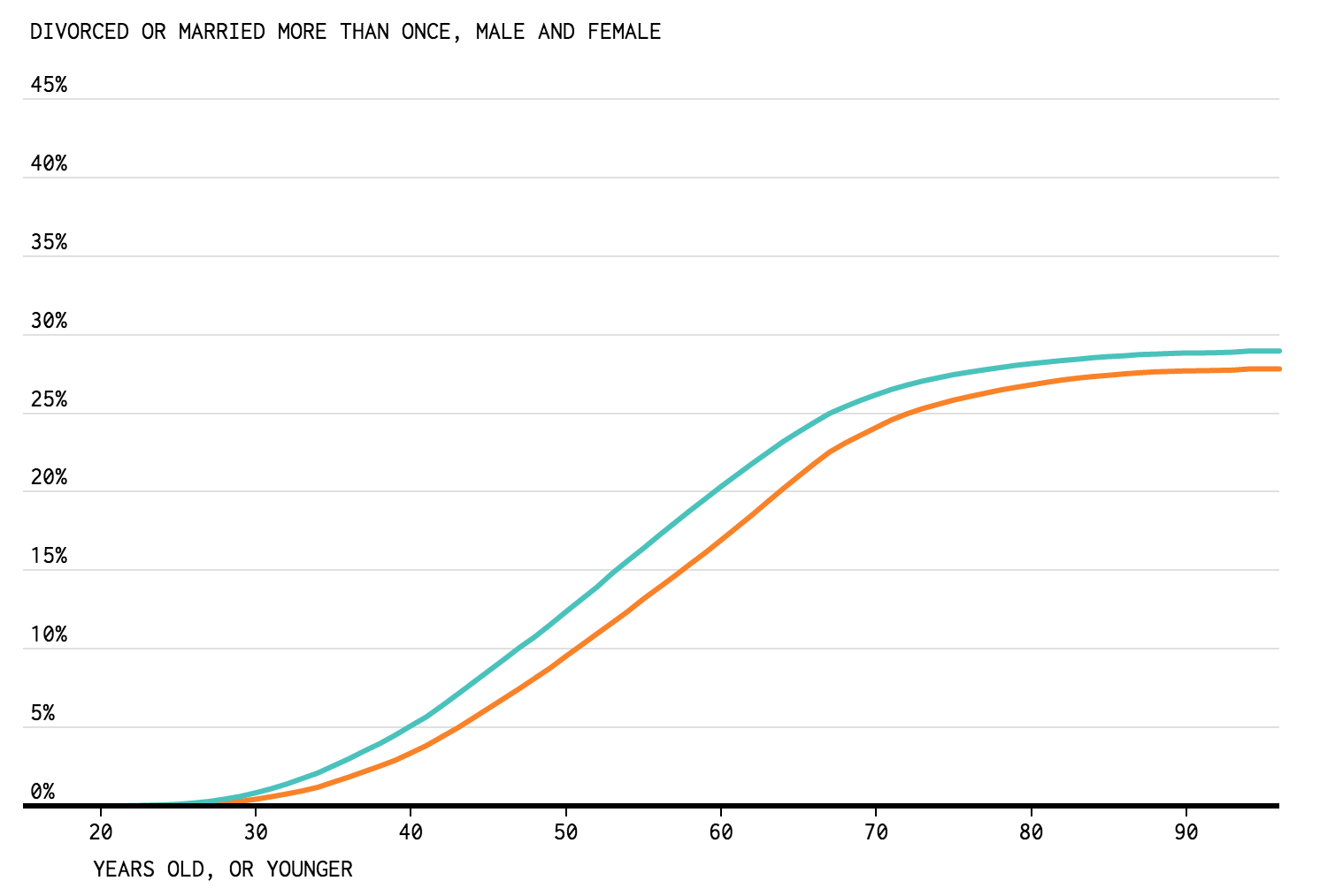
The reality isn't quite so bleak, with some demographics doing pretty well when it comes to longevity. For example, by age 60, only 26 percent of employed men are likely to have been divorced or remarried at some point in their lives, and 32 percent of women.
What Yau found most surprising in all that beautiful data was actually the difference between men and women's divorce rates, which seems strange when many of those men and women will be married to each other.
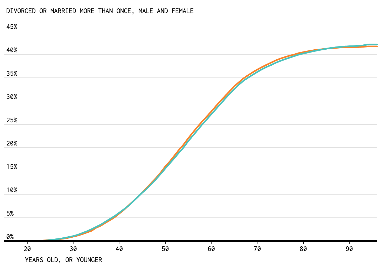
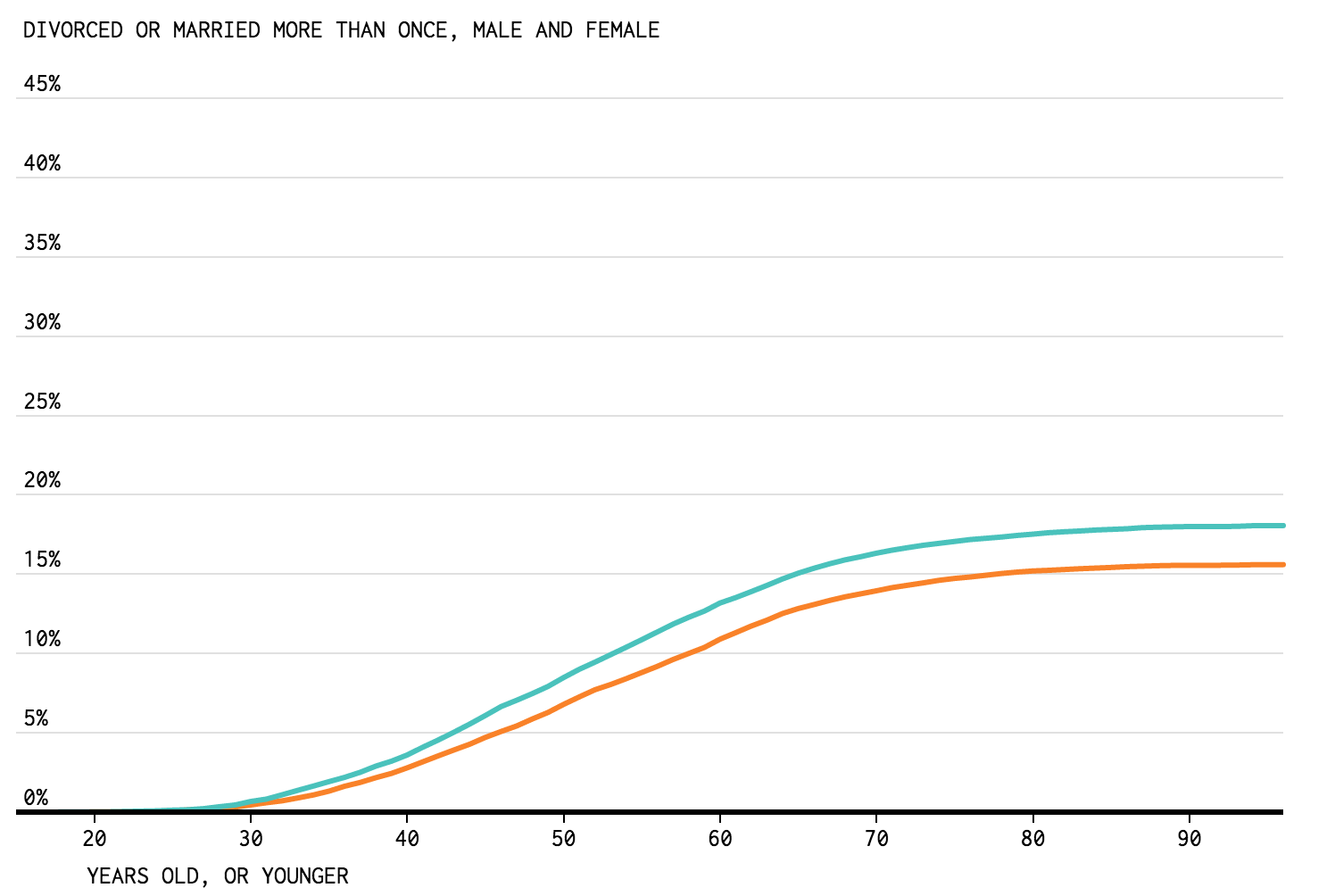
"I expected the percentages to end up at similar values for most of the groups, but there's some flip-flopping between men and women as you change between different demographics," he writes. "There also seems to be a bigger difference between men and women among the employed and those with advanced degrees."
Yau still doesn't know quite how explain this, but suggests it could be to do with the fact that there's less opportunity for men to divorce, seeing as they generally marry later and die earlier - which is both good and bad news, I guess.
Go and check out how likely it is that you'll get divorced in the next couple of years, and see some of the results by demographic below. And if you're not too happy with the results, don't worry, one of the most beautiful things about statistics is the outliers.
Employed:
 Nathan Yau/Flowing Data
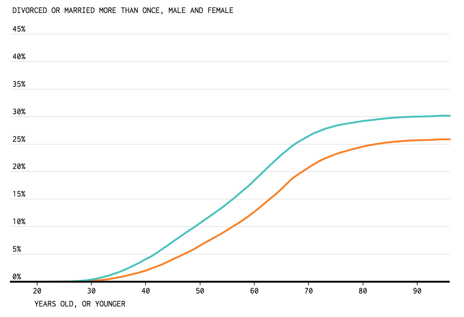
African American:
 Nathan Yau/Flowing Data
Asian:
 Nathan Yau/Flowing Data
White:
 Nathan Yau/Flowing Data
Bachelor's Degree:
 Nathan Yau/Flowing Data
Advanced degree:
 Nathan Yau/Flowing Data