We all know most maps of the world aren't entirely accurate. For starters, Africa is way bigger than it looks, and Greenland isn't nearly so vast.
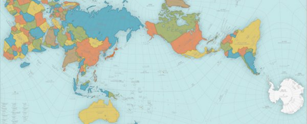
But a designer in Japan has created a map that's so accurate it's almost as good as a globe, and it's probably one of the best estimations you'll see of the real size of countries.
The design, called AuthaGraph, is so good, it's took out Japan's biggest design accolade, the Good Design Award, in 2016.
Created by artist and architect Hajime Narukawa, the map looks pretty weird at first glance, with an orientation shift between Asia and North America, but it's actually one of the most proportional maps we've got.
That's because creating a precise a flat map of our spherical planet is incredibly hard.
The map you're used to seeing pinned on classroom walls and in Atlases is known as a Mercator projection, and was first presented by the Flemish geographer Gerardus Mercator back in 1569.
This technique works to more or less fit the countries of the globe on a two-dimensional piece of paper, and is great for ocean navigation. But it comes at the expense of accuracy - the Mercator projection makes countries close to the pole look much bigger than they really are.
For example, Greenland looks roughly the same size as Africa on most maps, even though the African continent has 14 times more land mass.
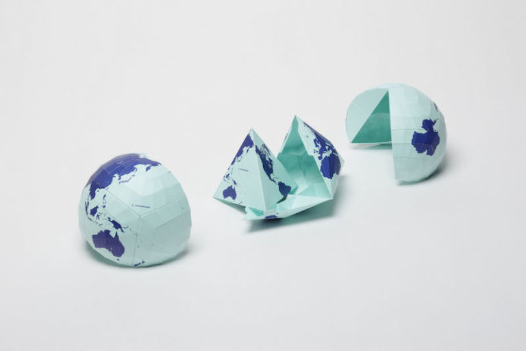
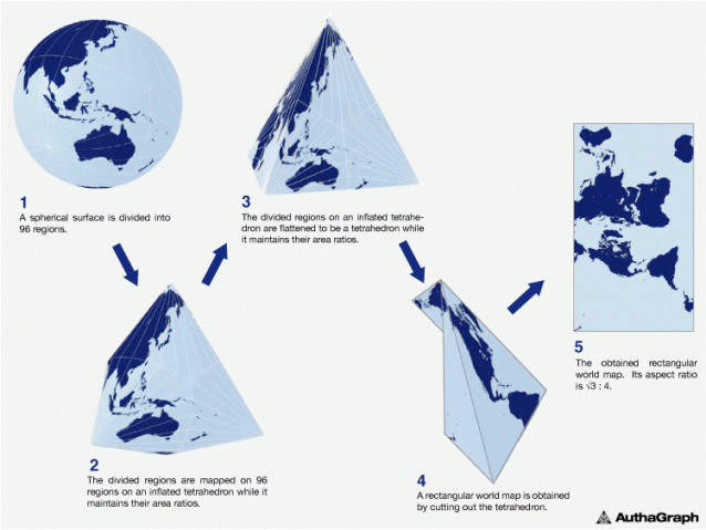
But the AuthaGraph design aimed to fix that, by dividing the globe up into 96 equal regions, and then transferring those dimensions from a sphere to a tetrahedron, before generating the final map.
By taking a few steps to get from a rounded sphere to a flat map, Narukawa managed to maintain the correct area ratios of land and water.
 AuthaGraph
"This original mapping method can transfer a spherical surface to a rectangular surface such as a map of the world while maintaining correctly proportions in areas," says the Good Design Award description.
"AuthaGraph faithfully represents all oceans, continents including the neglected Antarctica. These fit within a rectangular frame with no interruptions. The map can be tessellated without visible seams. Thus the AuthaGraphic world map provides an advanced precise perspective of our planet."
 AuthaGraph
This map isn't perfect - and seeing as north isn't necessarily at the top, it might not be the best for navigation. But it's pretty close.
"The map [needs] a further step to increase a number of subdivision for improving its accuracy to be officially called an area-equal map," the Good Design Award description reads.
You can find out more and get your own copy of the map here.
A version of this article was originally published in 2016.