You can now visualise our climate crisis for almost anywhere on Earth, thanks to a stunning interactive tool that will make you see red in every possible way.
Last year, climate scientist Ed Hawkins unveiled a powerful schematic for visualising global temperature changes: coloured 'warming stripes' communicating how the world has been getting hotter since records began. It was a hit.
Now, he's updated the project with a new interactive website based on regional temperature data for almost every country on Earth and every US state, sourced from the UK Met Office, Berkeley Earth, and other sources.
Basically, anywhere and everywhere you look, things are getting disturbingly hot, and colour stripes that were once tranquil blues are fast becoming alarming shades of red.
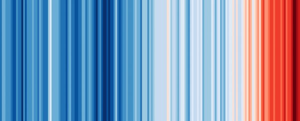
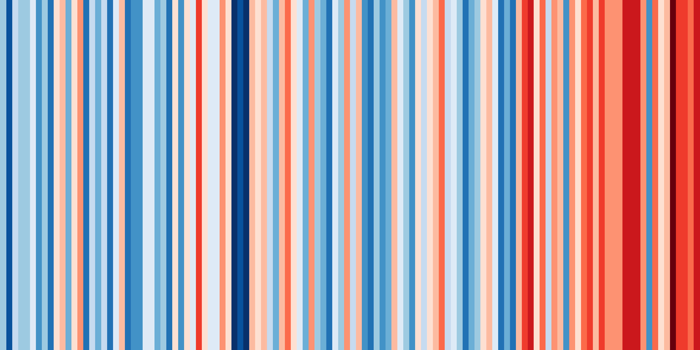
For starters, these are the warming stripes at the world level, showing annual global temperatures in each coloured vertical stripe between 1850 and 2018:

In the graphs, the average temperature in 1971–2000 is set as the boundary between blue and red. From that baseline, the darkest blues represent temperatures the most below average in the past 100+ years (depending on data sources), with the darkest reds showing temperatures most above average.
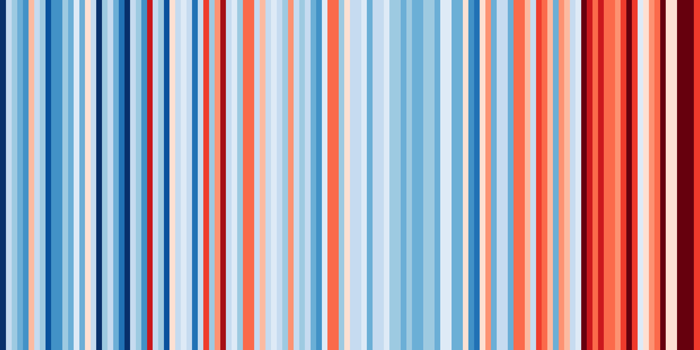
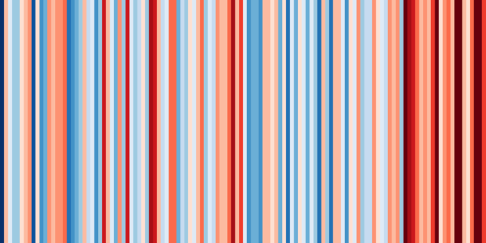
While every region's climate is unique in its own way, it's clear there's a definite trend here in terms of the changes we're seeing. Here's what the US looks like:
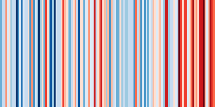
Here's Australia:

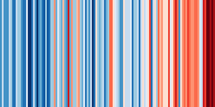
And here's the UK:

For good measure, here's China, Brazil, Pakistan, and Denmark:

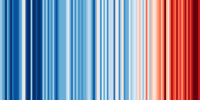
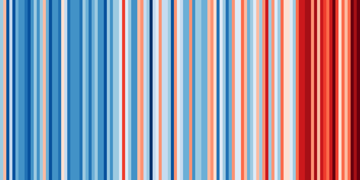
In every instance, it's clear to see that while there are variations in annual temperatures, on the whole every country is generally experiencing hotter temperatures over time – something you can see happening at the state level too.
This is what things look like in Texas, New York, and California:
Hawking, who works as a researcher at the University of Reading in the UK, has something of a knack for these brutally effective visual communications of climate change.
In 2017, he released an unnerving spiral animation, which quickly went viral, and was called "the most compelling global warming visualisation ever made" by the Washington Post.
His latest work is no less effective, and while it might be brutally minimalist, Hawkins says he specifically designed warming stripes that way, "to start conversations about our warming world and the risks of climate change".
"This visualisation removes all the distractions of standard graphs and allows the viewer to just see the long-term trends and variations in temperature without needing to interpret anything else," Hawkins explained last year.
Yep, we can see it, and it's impossible to look the other way.
Hawkins is also encouraging people to share the visualisation in their own creative ways, and Twitter has run with the challenge.
How could you #ShowYourStripes using the graphics from https://t.co/Zd3HFHcXQe?
— Ed Hawkins (@ed_hawkins) June 17, 2019
1) Paint your @Tesla like @NetZeroMN did pic.twitter.com/XI9lCF1I1j
3) Create a stunning dress like @huprice did#ShowYourStripes using https://t.co/Zd3HFHcXQe pic.twitter.com/921JBoqsEa
— Ed Hawkins (@ed_hawkins) June 17, 2019
You can access the interactive website at showyourstripes.info.